New (old) dress purchases

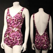
I honestly think I have a problem when it comes to buying dresses. I need to pay my masters fees, but instead I have purchased lots more dresses. It’s a real life problem.

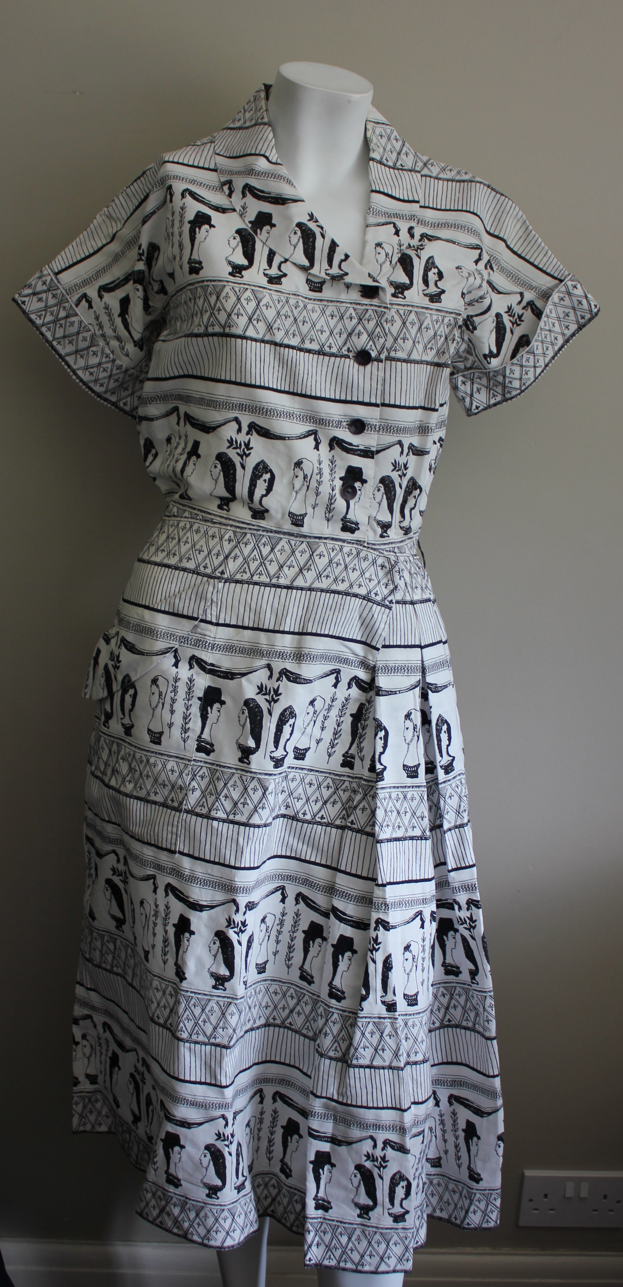
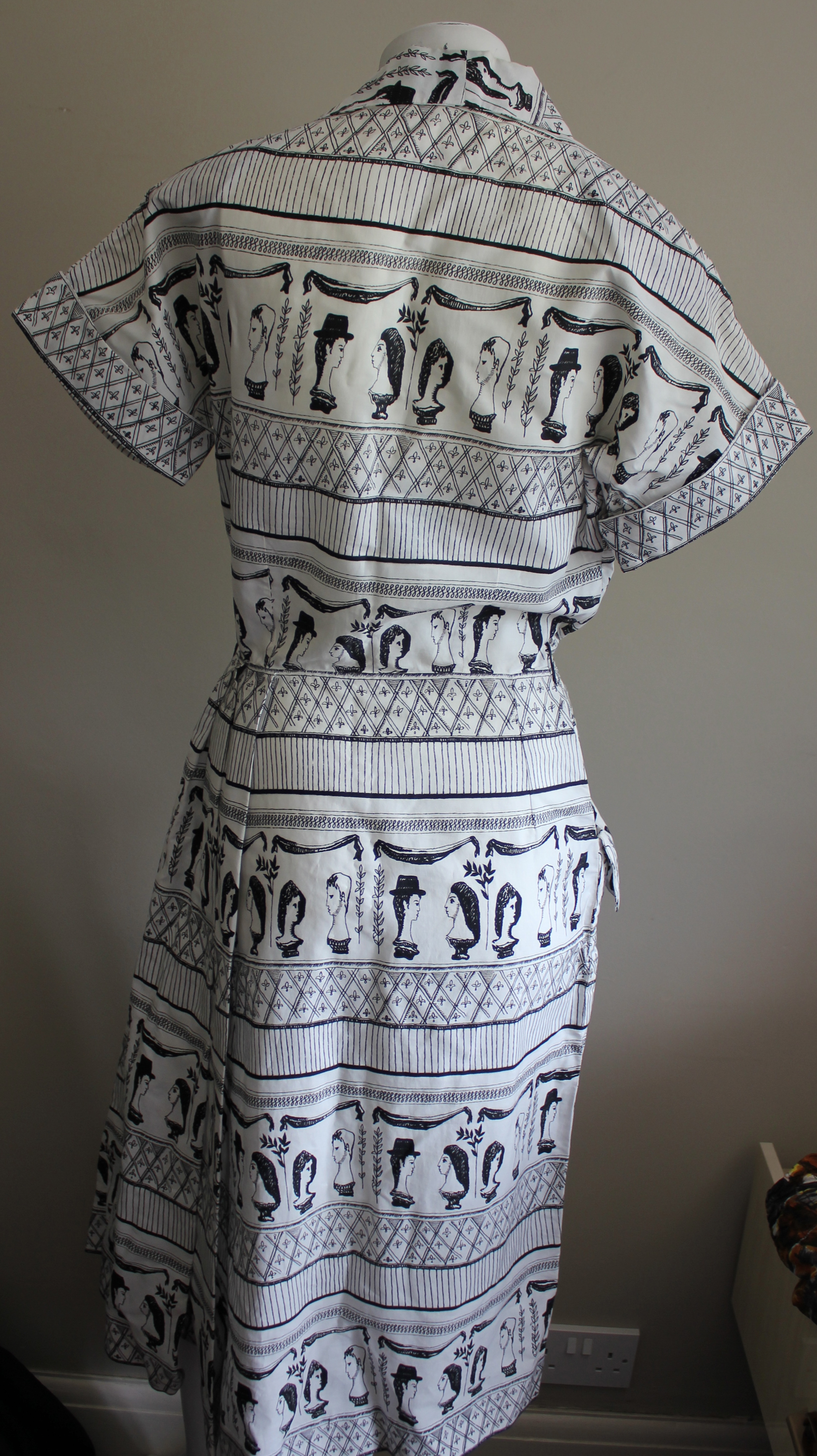
Anyway, I thought i should share one of said dresses because a) it’s fabulous and b) it’s a Horrockses

IMG_0660

IMG_0661

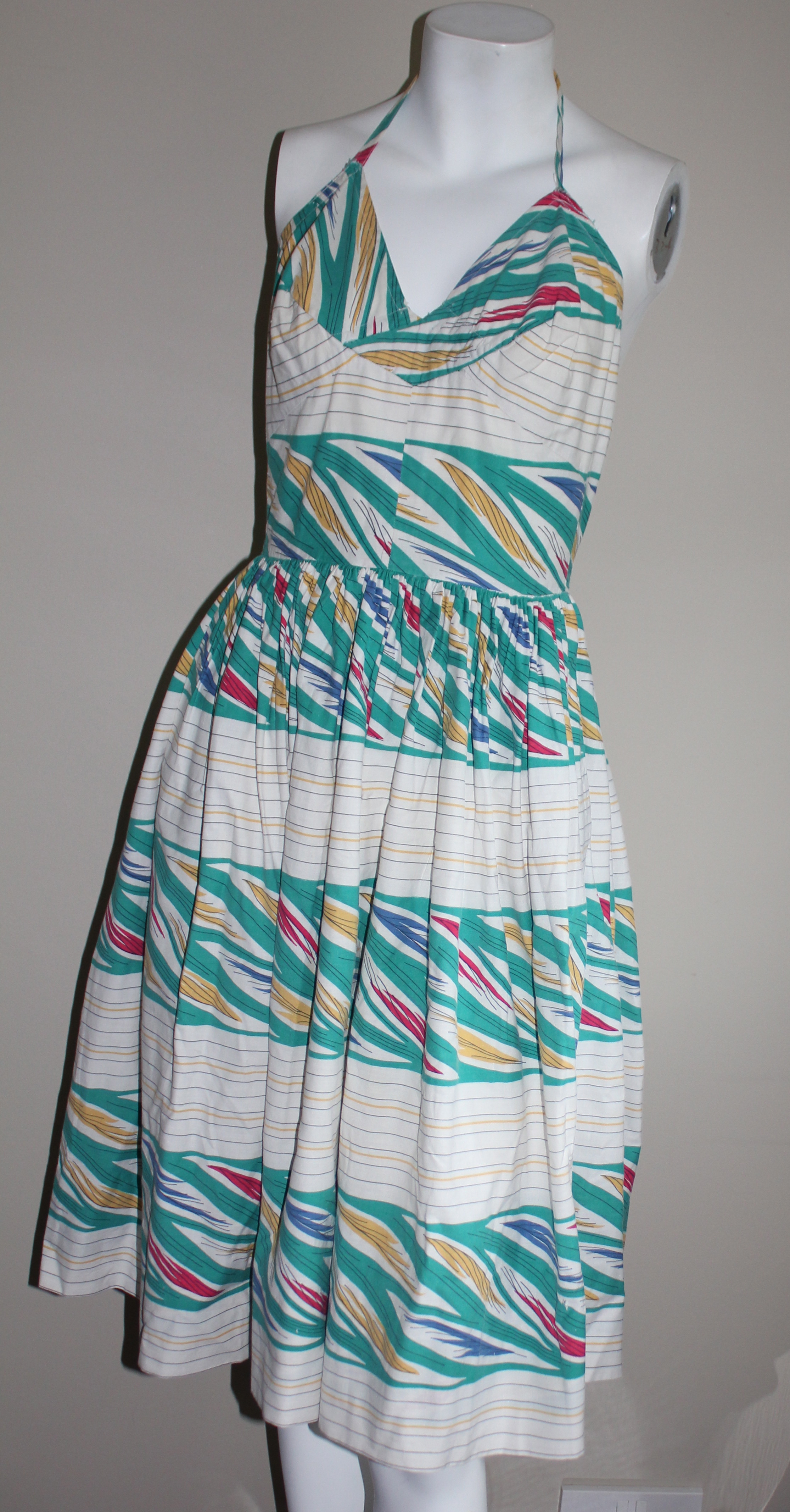
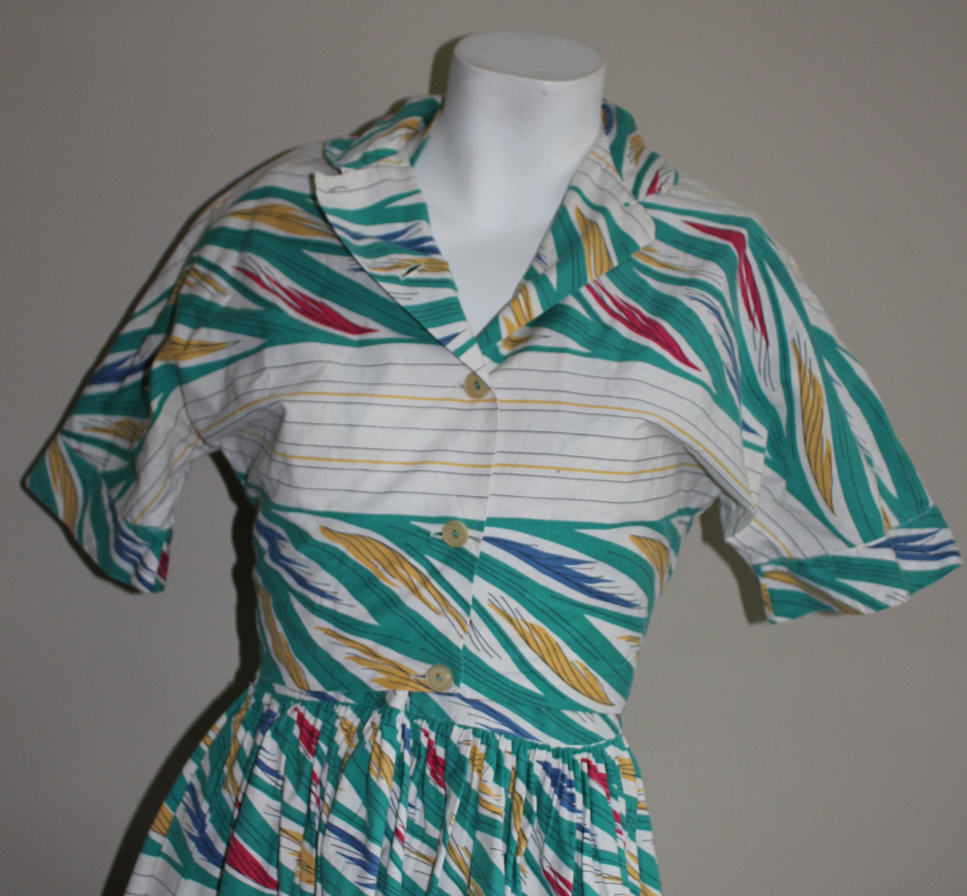
This lovely Horrockses number (yes, another one!) came from a lovely lady I fleetingly saw at the Chap Ball last year. She was wearing  what can only be described as the most fabulous dress I have ever seen. Anyway, we became friends on facebook and she offered me this simply sensational Horrockses which i could not resist adding to my collection.

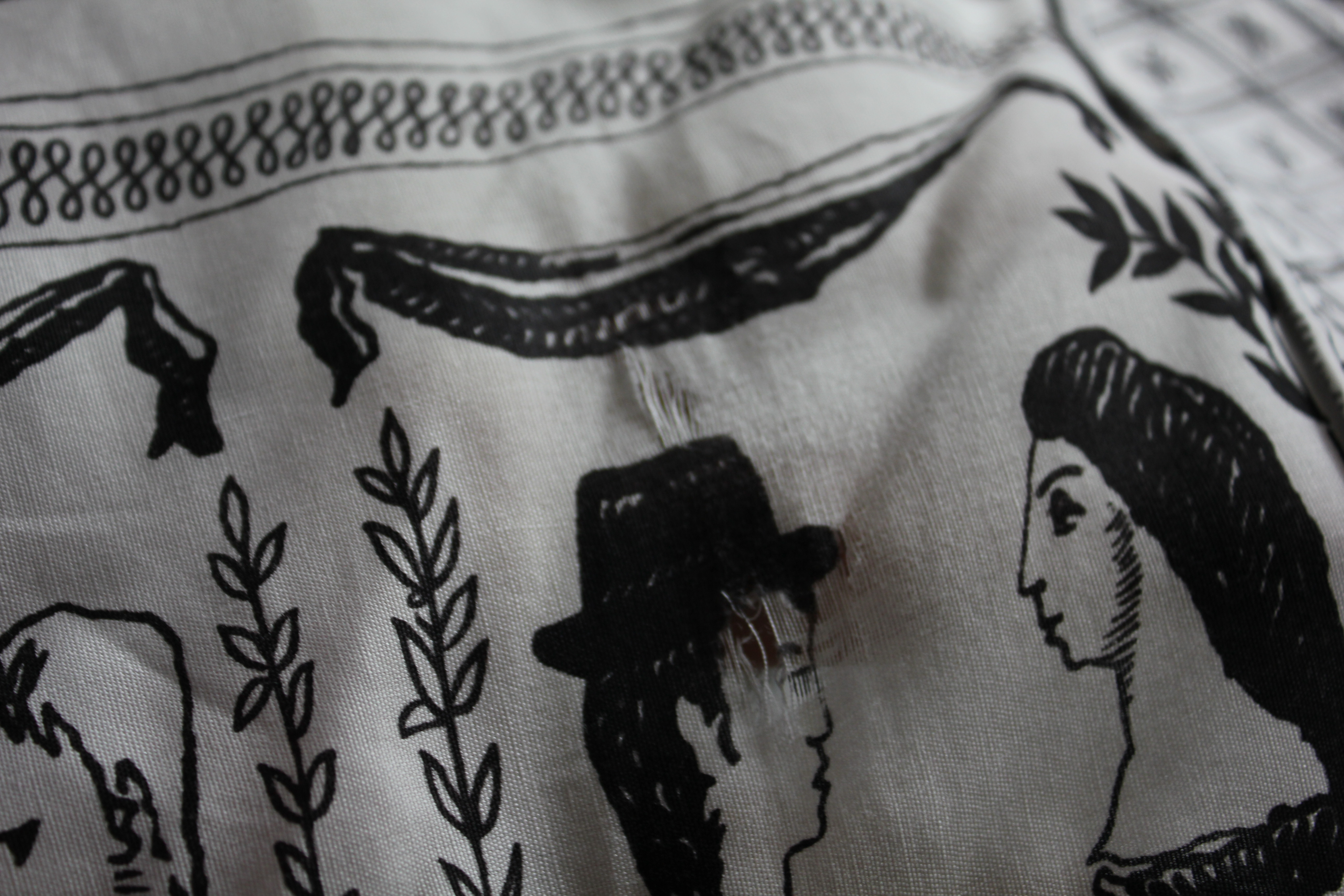
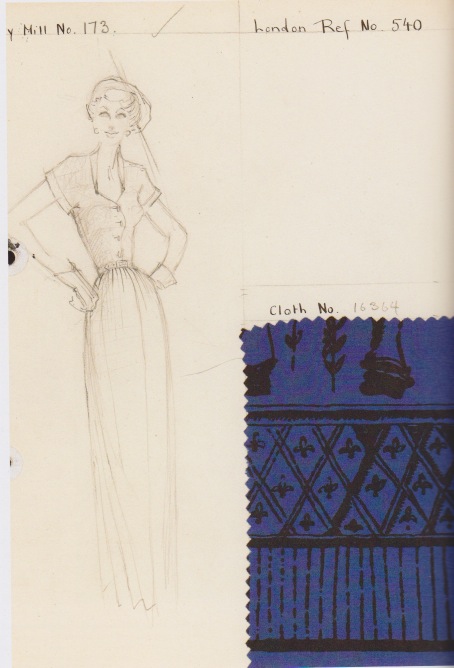
The dress is from 1948 and the print is by Alastair Morton, you can see the dress in a slightly different colourway in this advert. The dress cost £5.7. 8 a fair sum for a printed cotton frock in the period. The advert featured in Vogue in May 1948.

IMG_9055

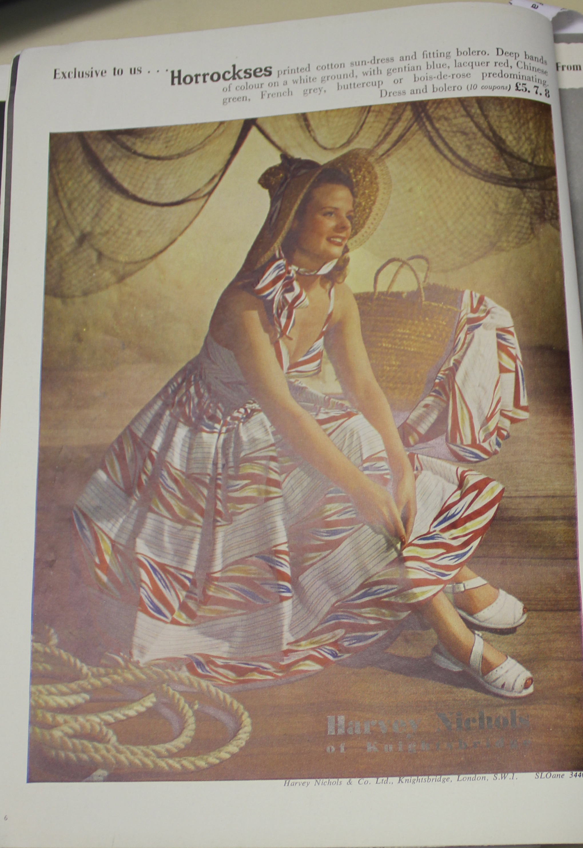
It’s interesting to see that the price of this dress is also shown with relation to the amount of coupons it would have cost (10). This was because rationing was still in force in 1948 (read more about rationing here). I was also interested that the dress fastens down the back with buttons, whereas a zip fastening would have probably been better. Again, I think this is probably due to rationing. Although I do have a few earlier Horrockses with zips most do fasten with buttons.

This advert also suggest that the dress was an exclusive to Harvey Nichols. I wonder whether this was just the dress in this colourway, or whether the actual print was an exclusive. My dress only has the Horrockses label, so I can’t be sure.

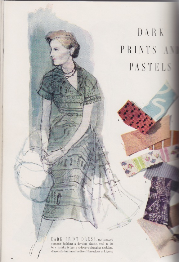
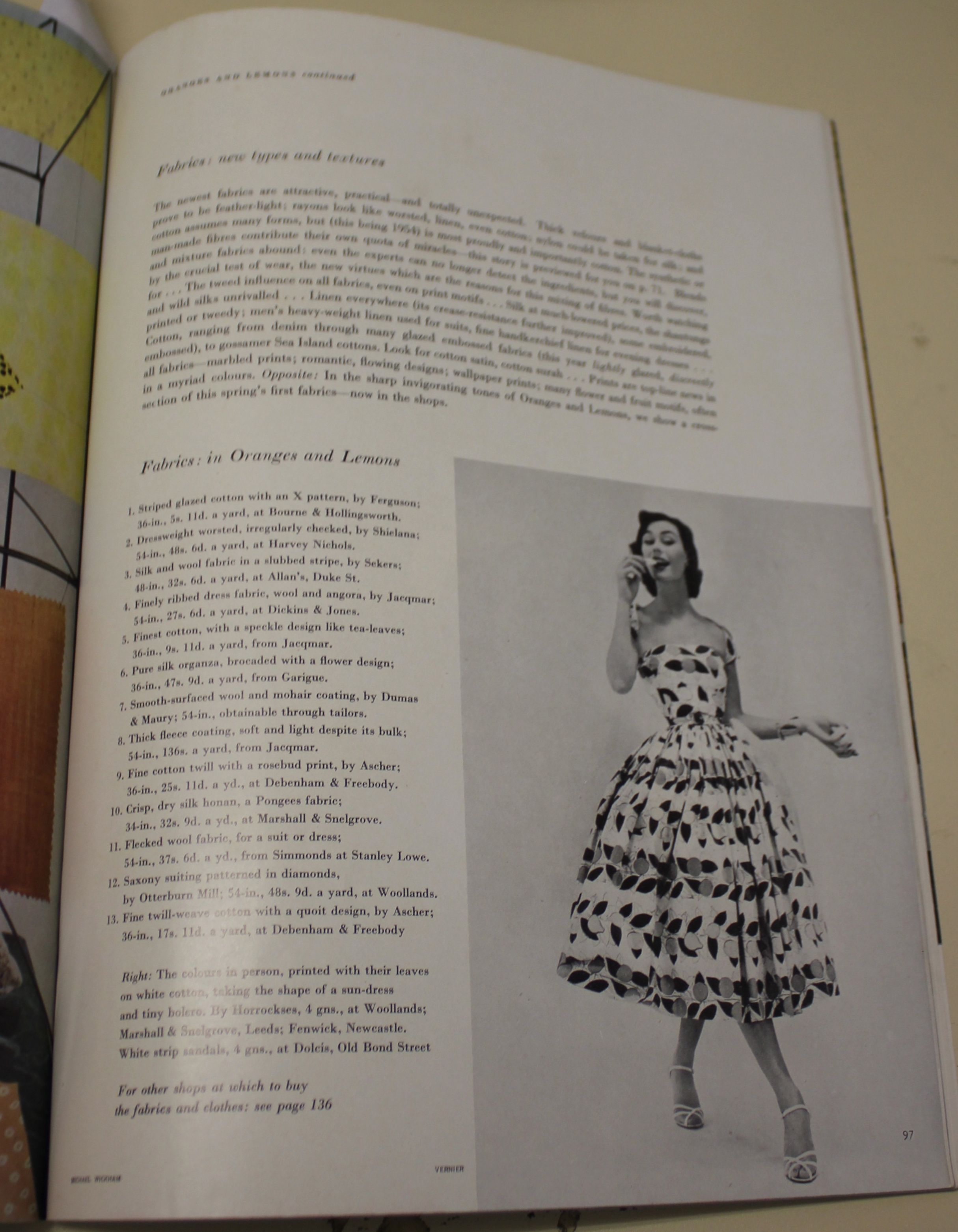
I was then rather chuffed to find an article ( by absolute accident) in the April 1948 issue of Ambassador. Images from the article are below, and you can see a number of absolute classic Horrockses prints that I have seen time and time again featured in it. I have also transcribed the full article as owing to my terrible photography skills you can’t really read it!

IMG_1280 IMG_1281 IMG_1282 IMG_1283 IMG_1284

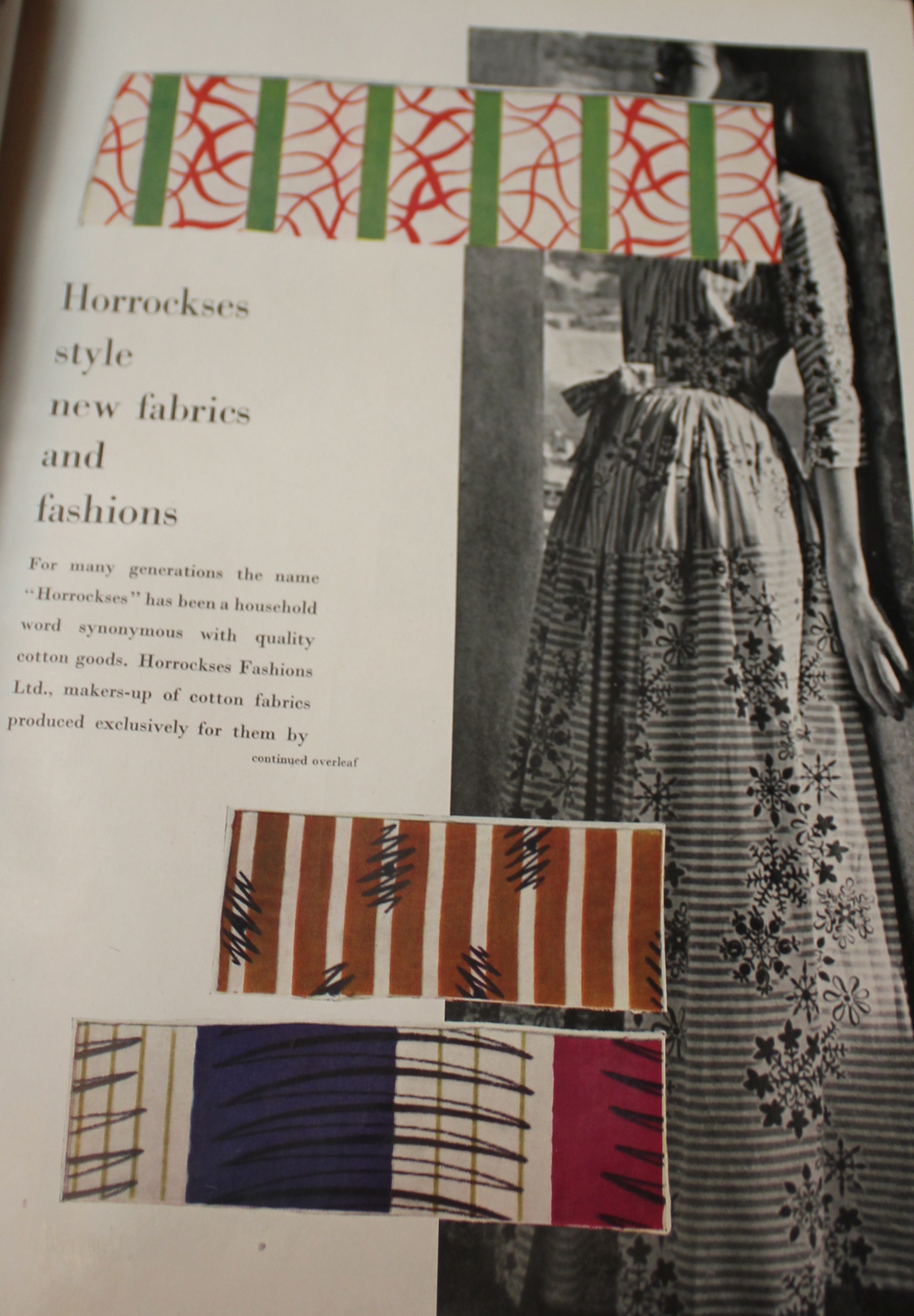
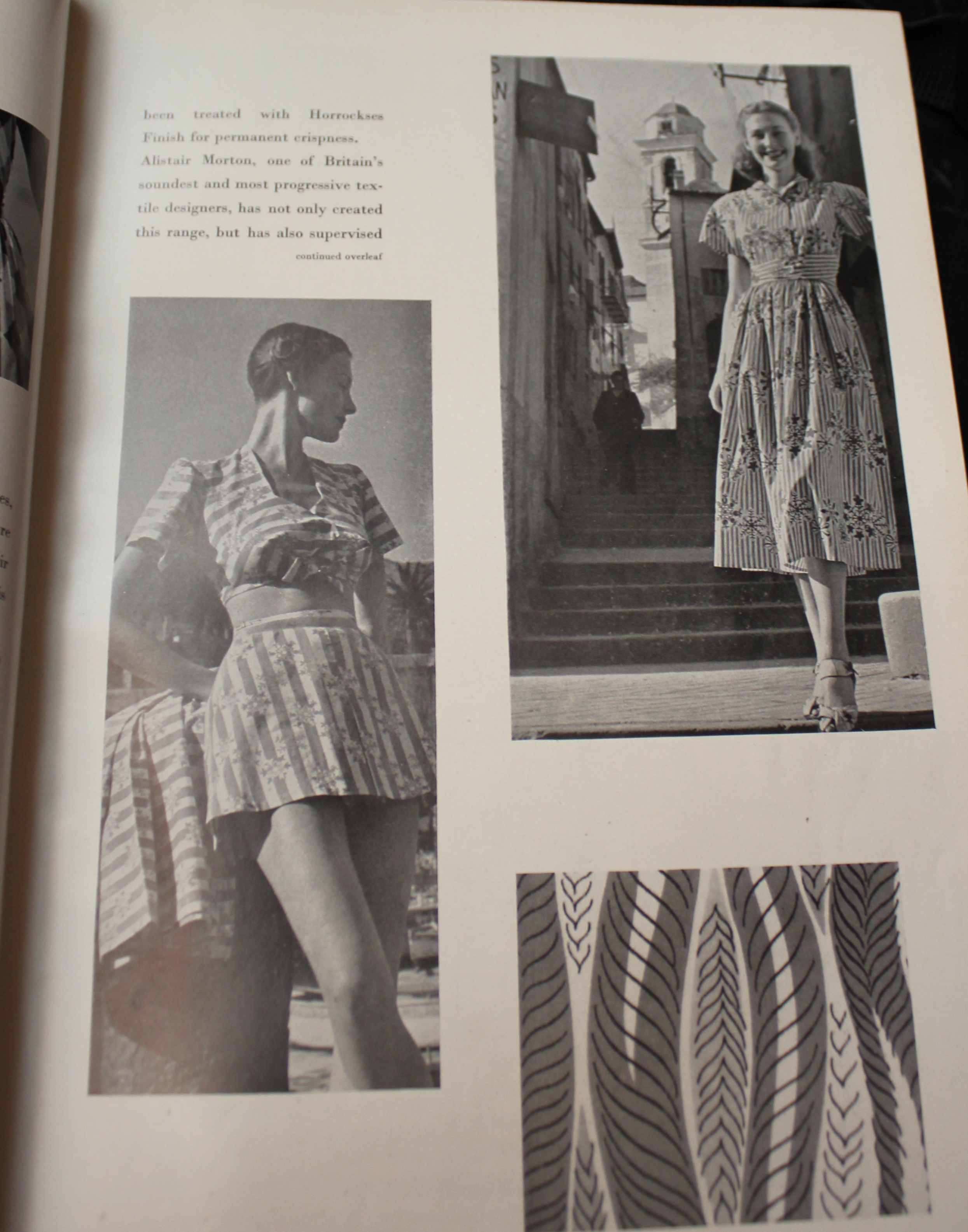
Horrockses style new fabrics and fashions

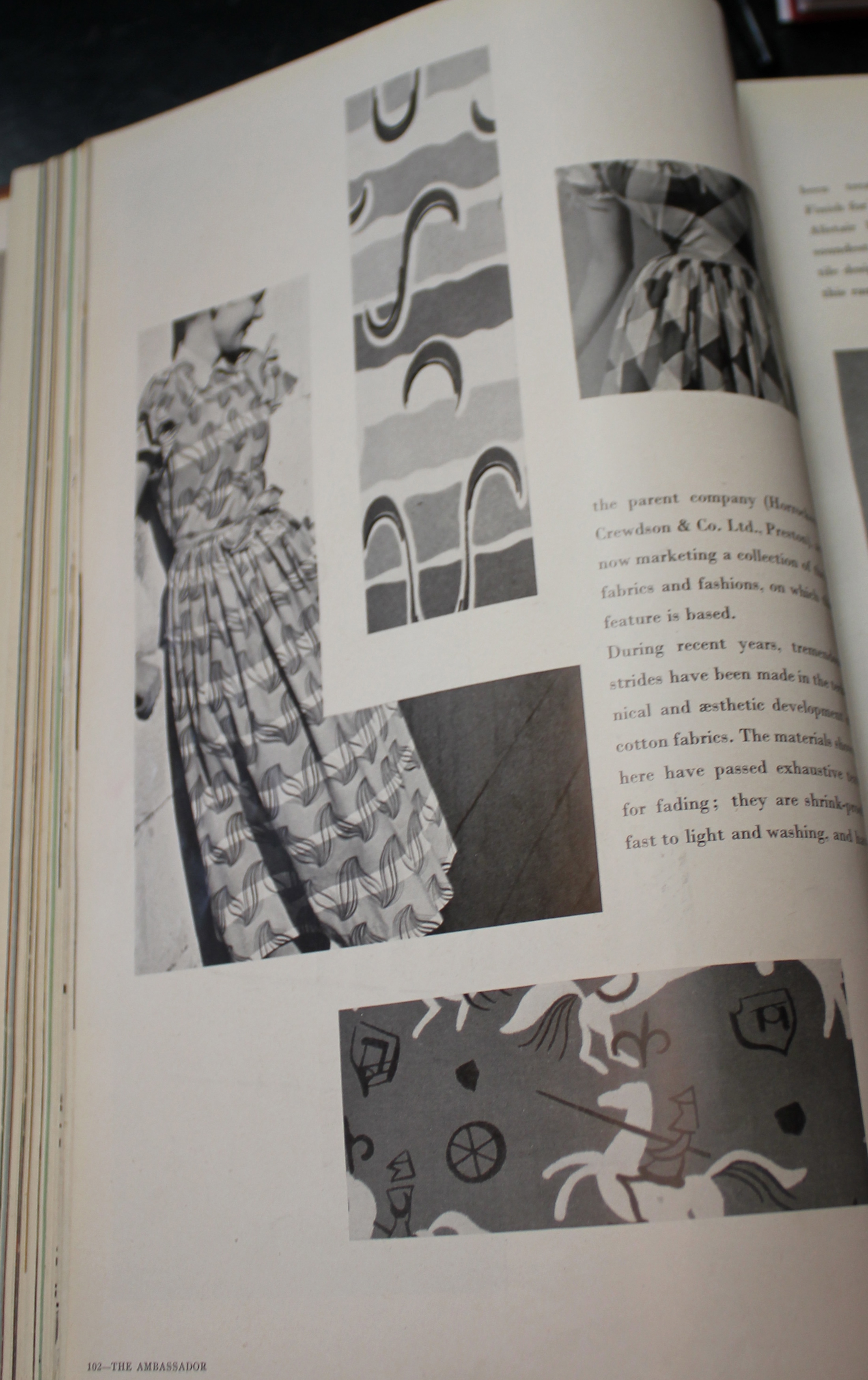
For many generations the name Horrockses has been a household name  synonymous with quality cotton goods. Horrockses fashions ltd. Makers-up of cotton fabrics produced exclusively for them by the parent company (Horrockses crewdon and Co. ltd. Preston) are now marketing a collection of fine fabrics and fashions on which this feature is based.


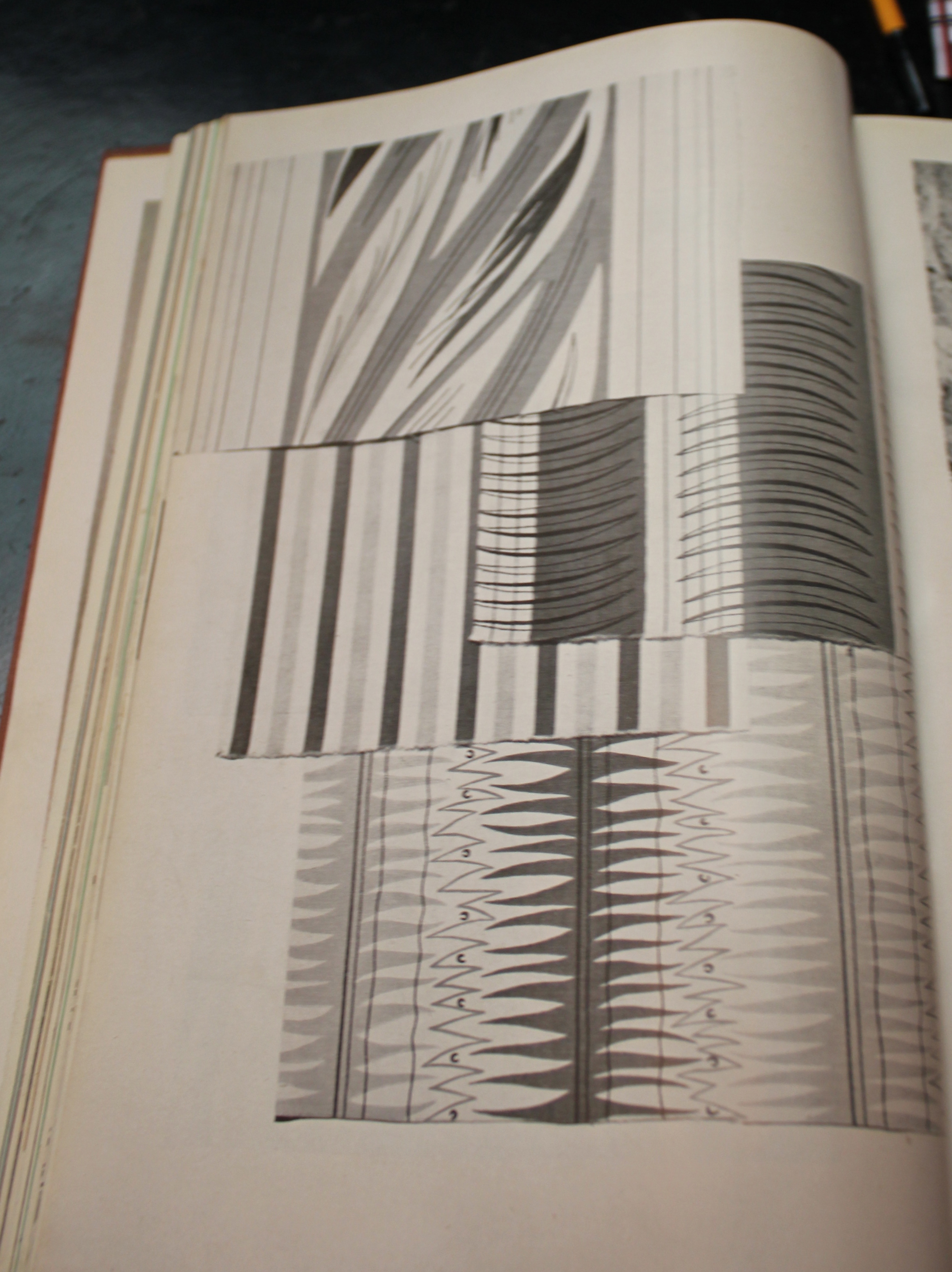
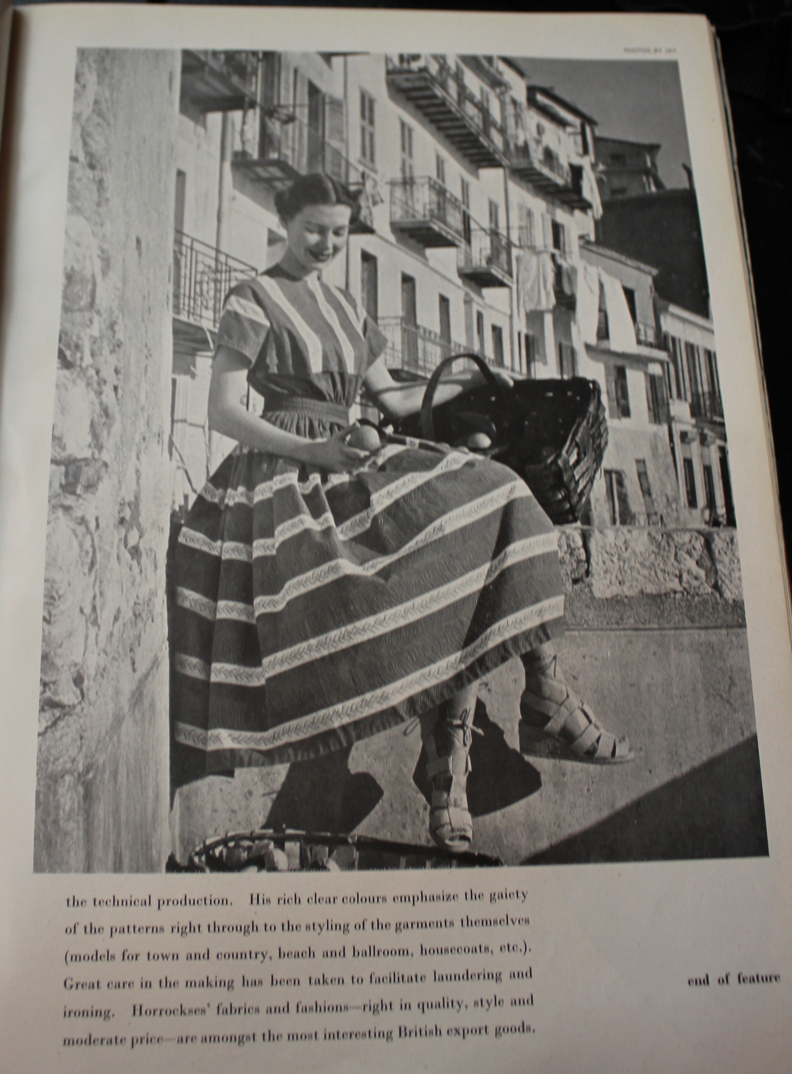
During recent years tremendous strides have been made in the technical and aesthetic development of  cotton fabrics. The materials shown here have passed exhaustive tests for fading; they are shrink-proof, fast to light and washing, and have been treated with Horrockses Finish for permanent crispness.


Alistair (sic) Morton, one of Britain’s soundest and most progressive textile designers, has not only created this range, but  has also supervised the technical production. His rich clear colours emphasise the gaiety of the patterns right through to the styling of the garments themselves (models for town and country, beach and ballroom, housecoats, etc.). Great care in the making has been taken to facilitate laundering and ironing. Horrockses’ fabrics and fashions- right in quality, style and moderate price- are amongst the most interesting British export goods.  

In a moment of intense geekery I was particularly interested to note the mention of Alastair Morton here, as Horrockses were keen to portray a total image for the brand rather than convey the individual designer. Here, and also in a later 1948 issue of Ambassador (an altogether similar feature) Morton’s name was prominently featured. Perhaps early on in their marketing strategy this was a technique they chose to follow, before later ( i reckon after Cleveland Belle became director) abandoned. My other thought on this is whether this was actually an extended advert that Horrockses paid for, or whether this feature was of the Ambassador magazine’s choosing…If this was not a promotional feature it was certainly unusual for a single company to take up a whole article in this manner for Ambassador and again suggests the importance of the brand in the late 1940s.

On a slightly related note, if you want to help me out, so I have the money to pay my masters fees ( I promise I won’t spend it on more dresses) I have lots of fabulous pieces in my etsy shop right now, and on my ebay too.

Finding “real” dresses in Vogue

Last week I got down to a very important section of my research for my MA dissertation that involved looking at every copy of British Vogue from 1945 to 1960. I haven’t quite got through them all yet, but I have managed the bulk!

My research turned up some interesting ideas/ adverts that will feed into my dissertation but also some fascinating images relating to Horrockses. I’ve been fastidious with keeping a record of any dresses from my collection that were advertised in the magazine, but on this look through I turned up three images that relate to pieces I own.

IMG_9452

First off this image

In this fashion sketch you can just about make out the giraffe print. I believe this is the same print that features on a dress from my personal collection. I had always suspected it dated between roughly 1952 and 1955, but this confirms that the dress dates to 1952. (featured in Vogue June 1952)

The caption reads as follows “Serene sightseer…gay, cool and appropriate all day in a red cotton print skirt, sleeveless black jersey, print scarf eith black reverse- wear it alternatively as a tiny shawl. By Horrockses, £7 19s.

I’ve seen the skirt version of this print in green before, so I am assuming this is what the editorial relates to.

IMG_2030

And here is the dress itself! I will soon have some better pics of this dress (I had it photographed last week) but this is a quick snap of it I took before it was repaired.

You can see this dress in further posts here and here (I’m wearing it in the second of these posts, but I’ll be honest I was feeling a *tad* worse for wear when these pictures were taken!)

And here is another dress I turned up in Vogue.

horrockses

Here is the original editorial.

IMG_0653

IMG_0658 IMG_0657

IMG_0656

IMG_0651

IMG_0650

Here is the dress. I think the print is probably by Graham Sutherland. Sadly my example of this print has seen better days, the fabric under the arms is very thin, and perhaps beyond repair…if anyone thinks it can be tackled though do give me a shout. I’ve actually had this dress around 4 years now but have never shared it on the blog before owing to its poor condition.

Scan 5

Interestingly you can see that the print also features in the Horrockses book, although you only see a tiny sliver of the fabric in the book, which does not even slightly convey how exciting the print is in reality. I think this whole design must have been an exclusive for Liberty because both the book and Vogue state it as an exclusive despite the two dress designs being slightly different.

And finally do you remember my excitement after I purchased this number the other week?

IMG_8290

IMG_8295

Well, I found this featured in Vogue too! (sorry about my bra straps in the second picture, eugh, pet hate).

IMG_9898

Here it is featured in february 1954. It was priced at 4gns, which for a Horrockses was actually very cheap (most were 6gns minimum) I have to admit that the construction of this one isn’t as good as many of my other Horrockses aree, which maybe accounts as to why the price was much lower.

Are you ready for the beach?

I don’t know about you, but the weather where I live (Greater London) has been pretty spiffing the last few days! So much so it has enabled me to get out the full on vintage frocks (outfit posts coming soon of course!). This meant that my next sale was one of my easiest to create. It’s a height of summer sale!!!

I’ve got more sunnies, hats, beach dresses and swimsuits than you can shake a stick at in a beautiful range of colours and fabrics.

View all the listings here!

First off is a brilliant selection of vintage sunglasses.

Fabulous 50s cats eyes

80s totoiseshell Ray ban wayfarers

Want to keep your head out of the sun? How about a fun vintage hat to sheild you from the ray.

Pop up 50s beach hat

80s large straw hat

I also went a bit mad with the stripes this week, because who doesn’t love a good striped outfit for summer?

Late 50s pastel stripe dress


Ted Lapidus shirt (who apparently in the 60s I’ve found out today was at the forefront of French pret-a-porter)

But the piece de resistance has to be the selection of vintage swimsuits I have on offer. Both Naomi and I have raided our collections to give you some real treats.

Amazing deadstock 50s swimsuit

Skirted 50s swimsuit

One of the cutest “beachball” print 50s swim tops

40s or 50s raspberry red Slix swimsuit (so stretchy it looked weird on my mannequin, so I took to modelling it instead)

50s little light weight beach dress (so unbelievably perfect for the heat wave we are experiencing)

Or for the collectors out there how about this orange wool number from the 1920s?

Since I created this listing I have found the V&A have an almost identical suit in grey and red. That’s a good piece of vintage for you right there!!!

Don’t forget, if you have any questions just drop me an email

liztregenza@hotmail.com

I’ve left this post a little late, but there are just THREE DAYS left on this auction, and lots of bargains still to be had!

View all the listings here!