Horrockses and Lucienne Day

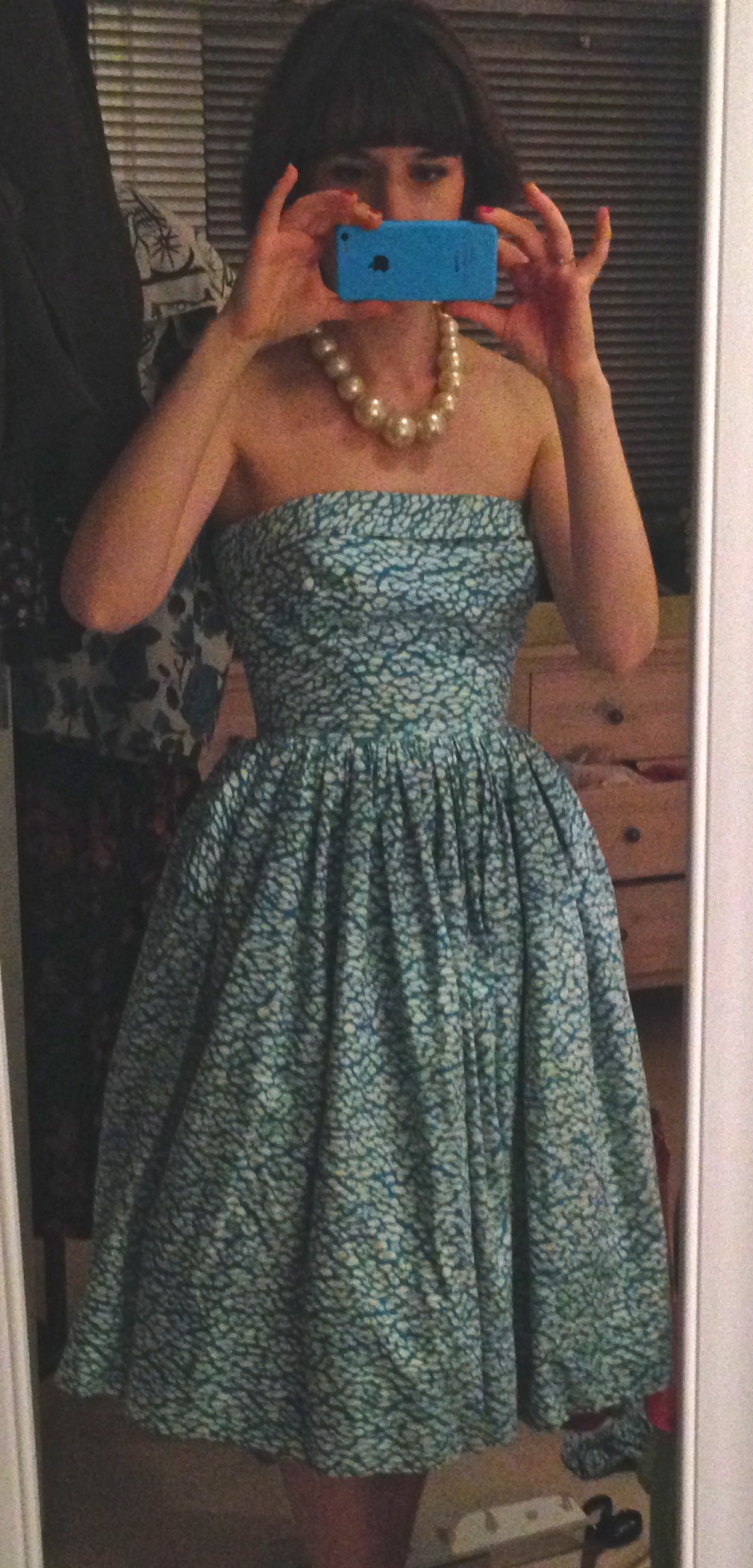
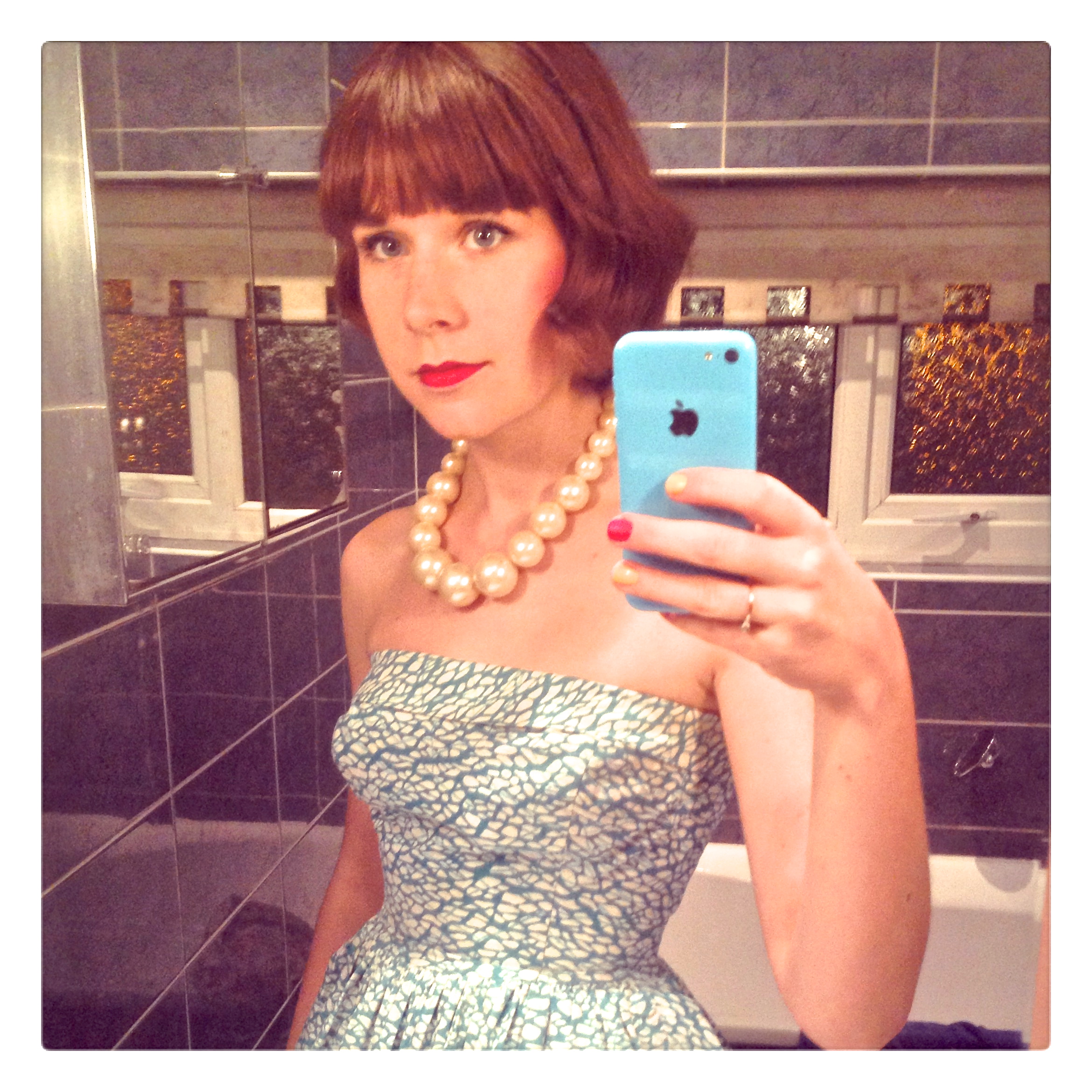
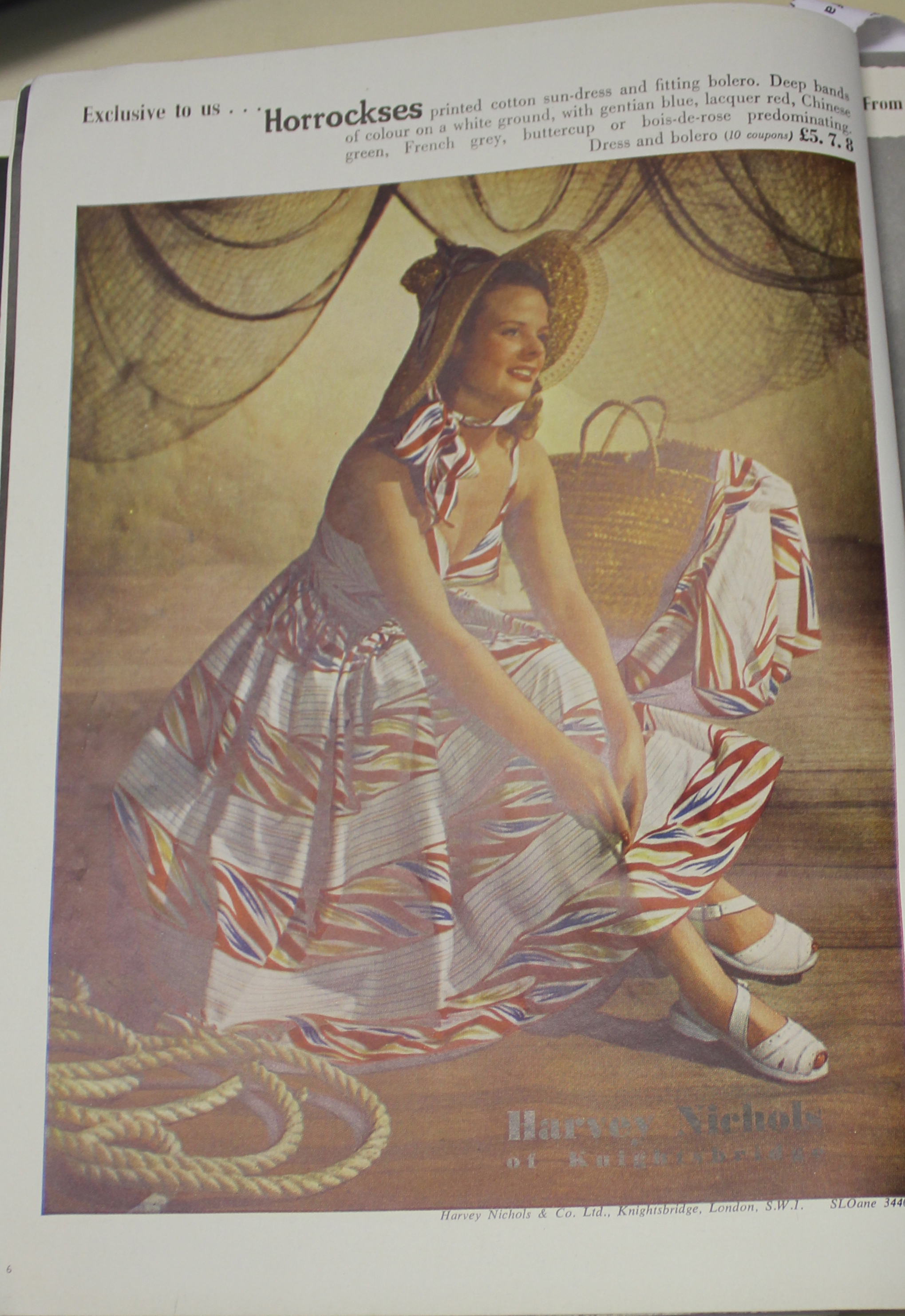
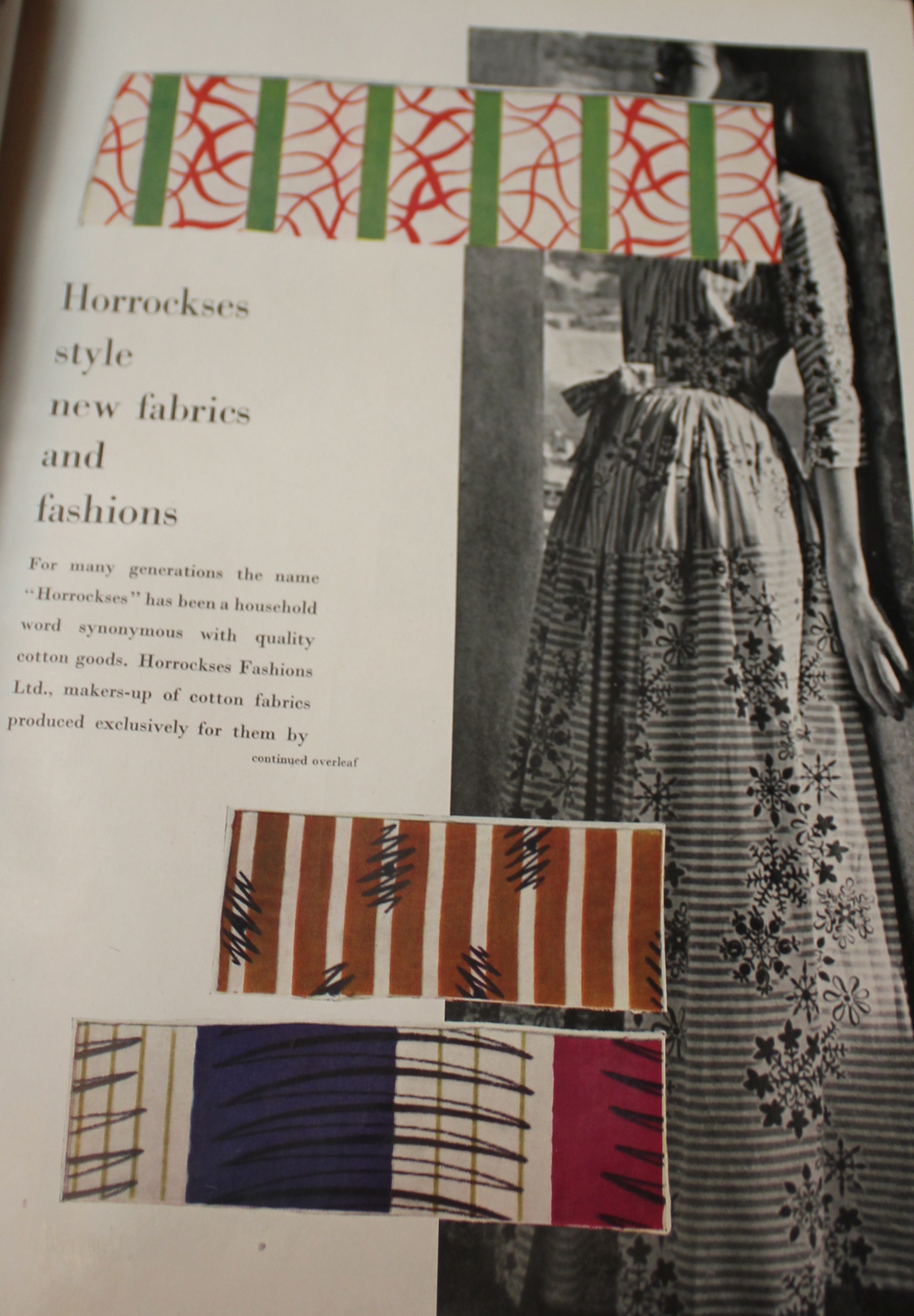
Whilst busily researching for my masters dissertation today (ok, perhaps not so busily, perhaps more flicking through the Ambassador at a leisurely speed) I happened to stumble across something rather exciting. Initially I felt like I might keep this snippet of information to myself, but  realised it was just too good not to share!

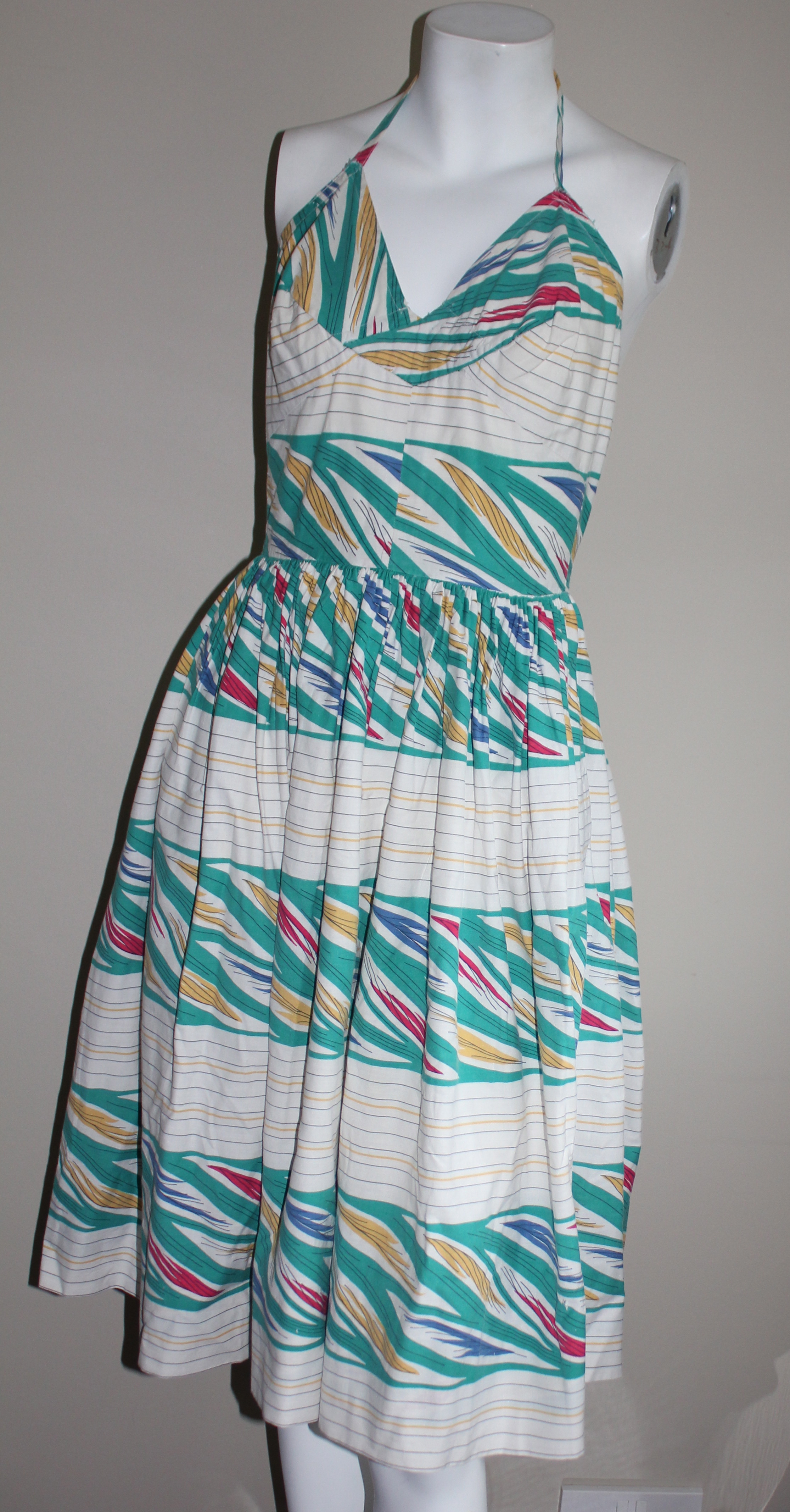
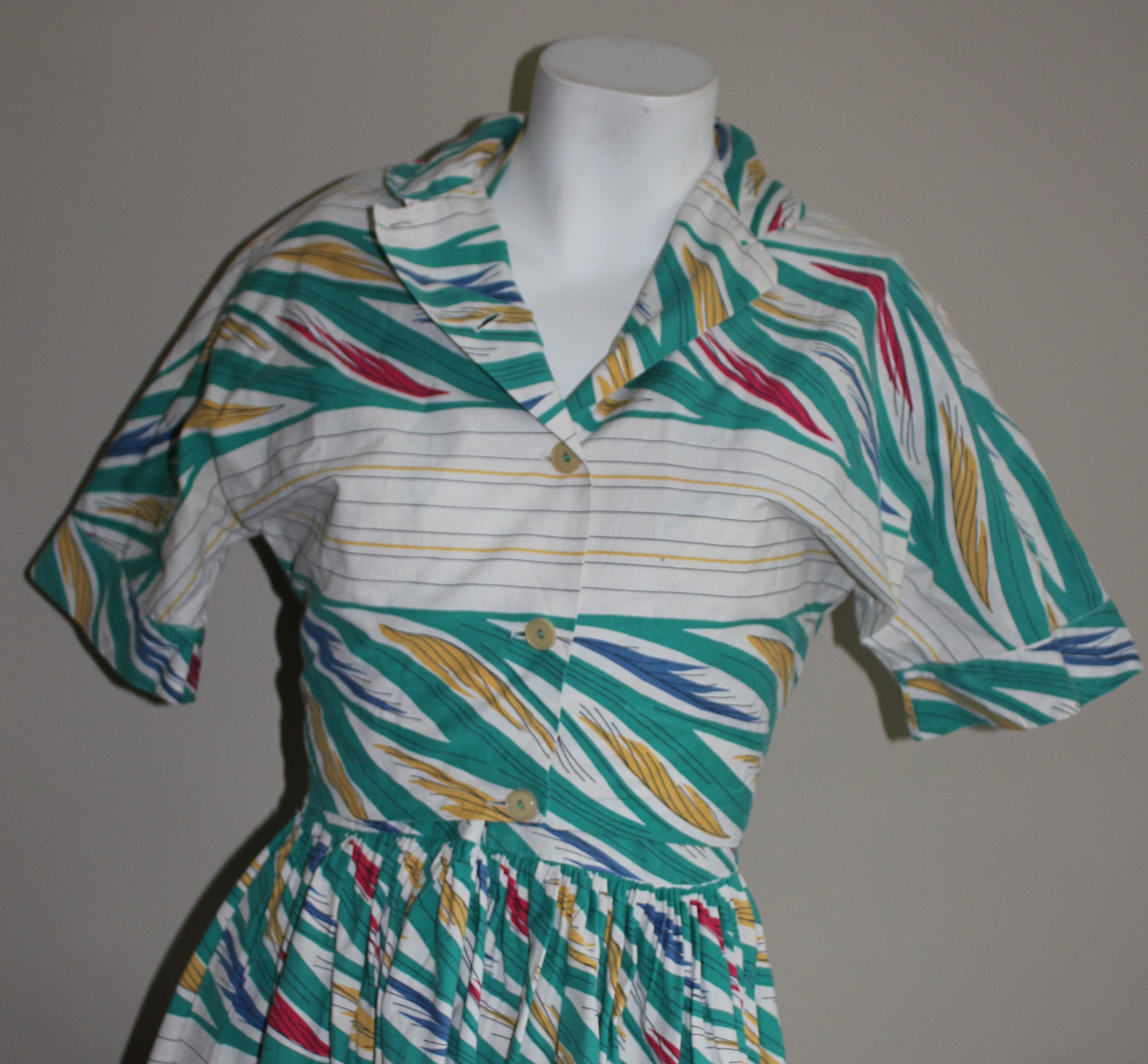
Thanks to Chris Boydell I have long-since known that Horrockses purchased textile designs from Lucienne Day, but it was never clear whether any were actually put into production. This was because Horrockses purchased up to 1000 prints per year and not all of them were used. Furthermore, Horrockses did not tend to publicise the name of the designers who created the prints. In the early years the links between the brand and Alastair Morton were made explicit, but as time went on they were more determined to create a unified brand image and hence such links were played down. The notable exceptions being Louis le Brocquy and Eduardo Paolozzi. This all meant that even if Lucienne Day’s print had gone into production it would be difficult to know for certain if they were designed by her.

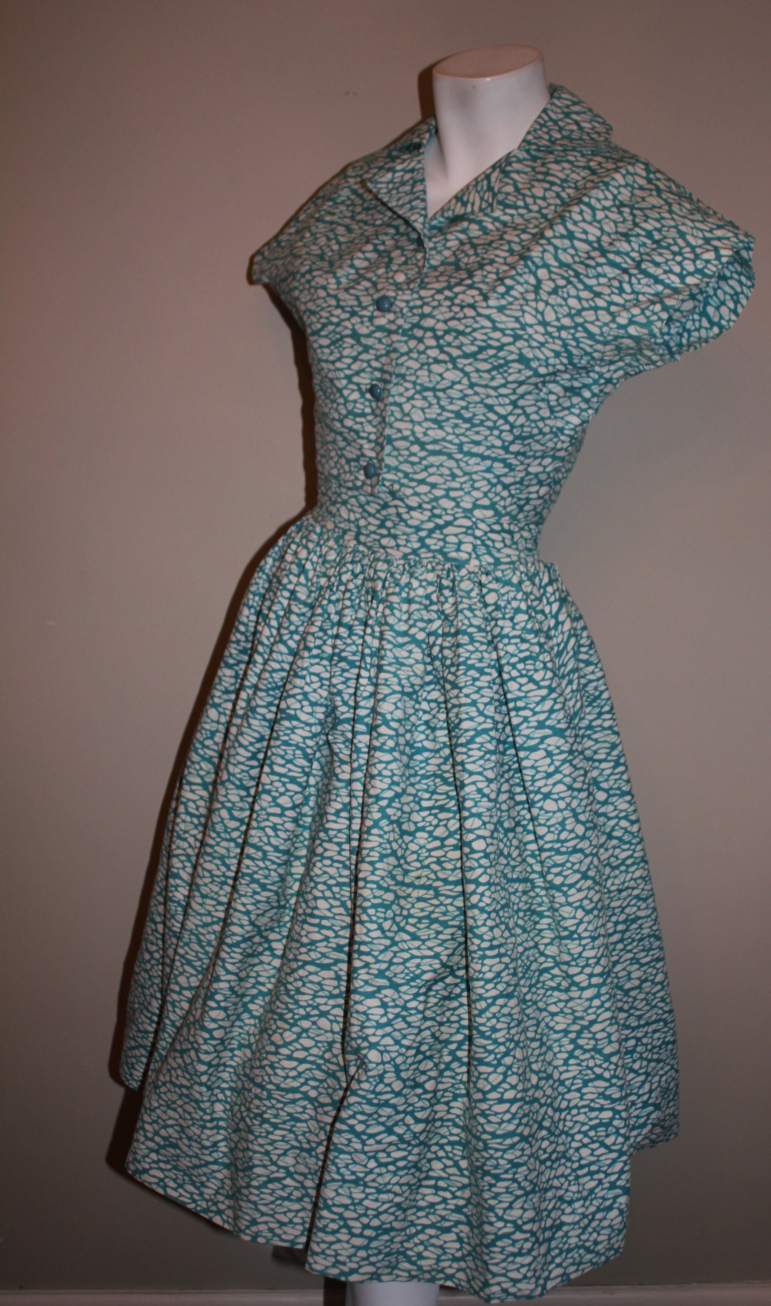
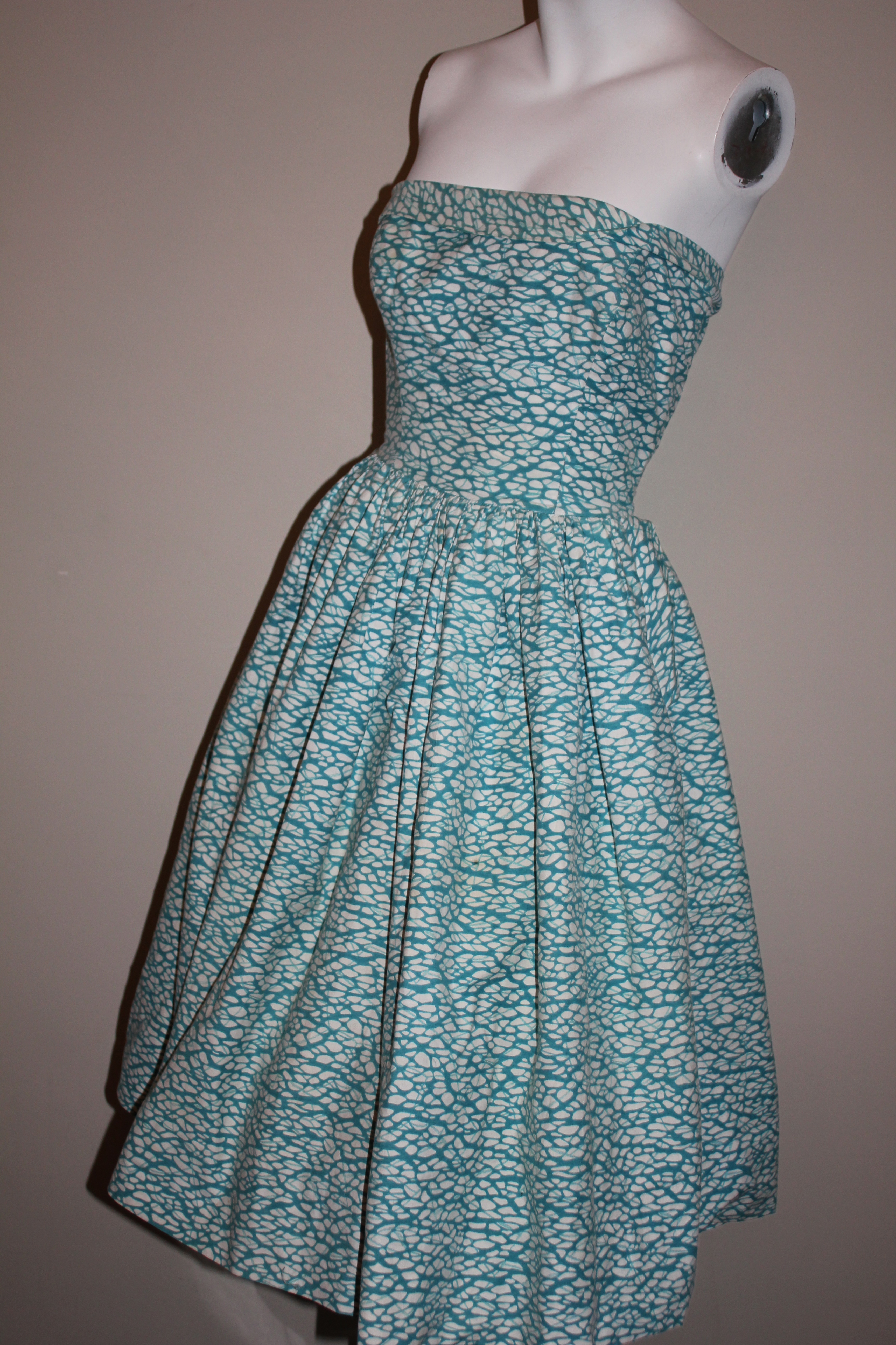
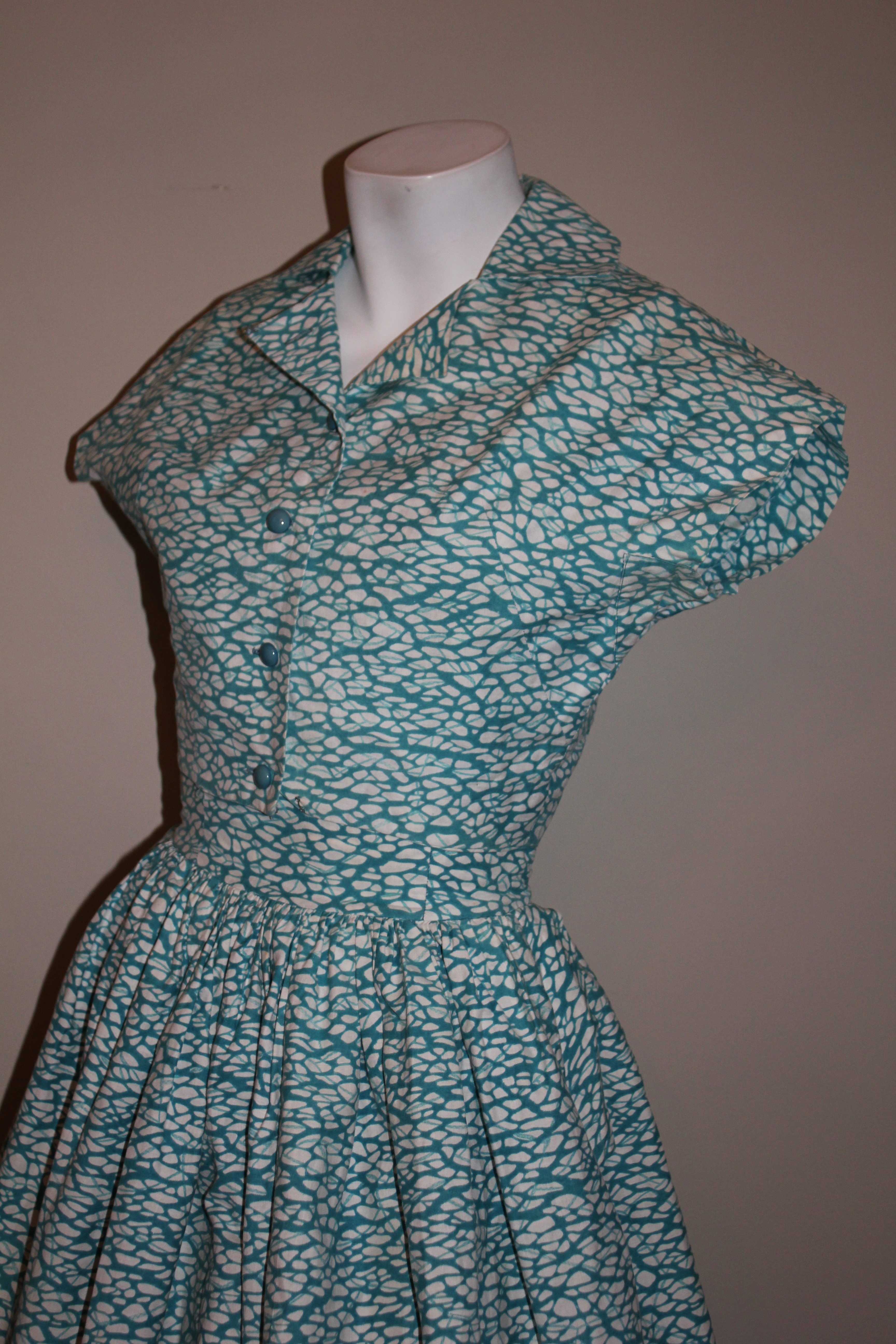
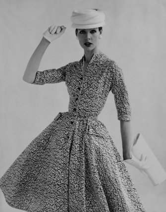
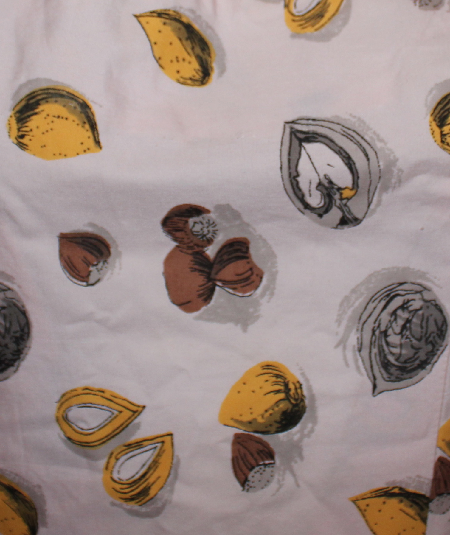
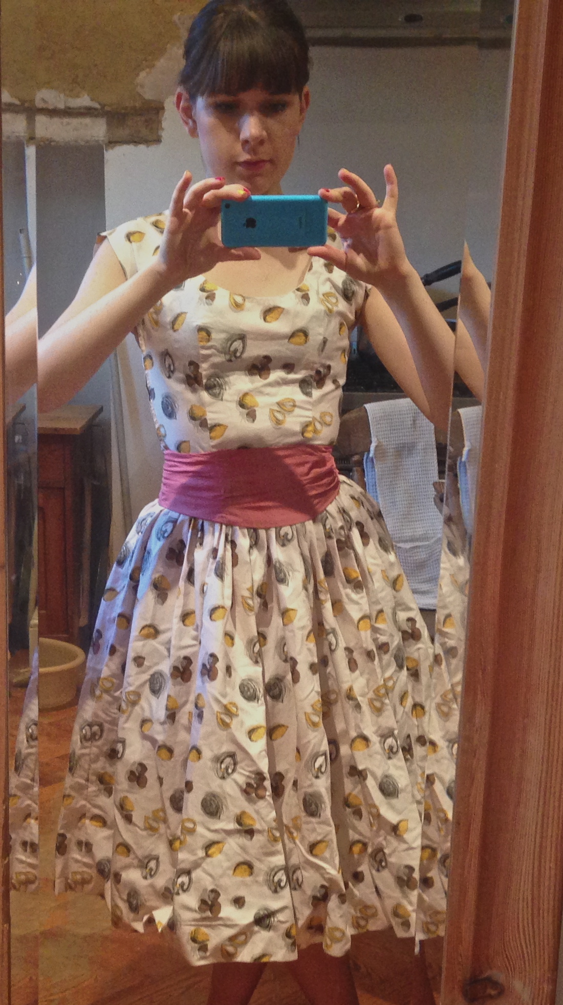
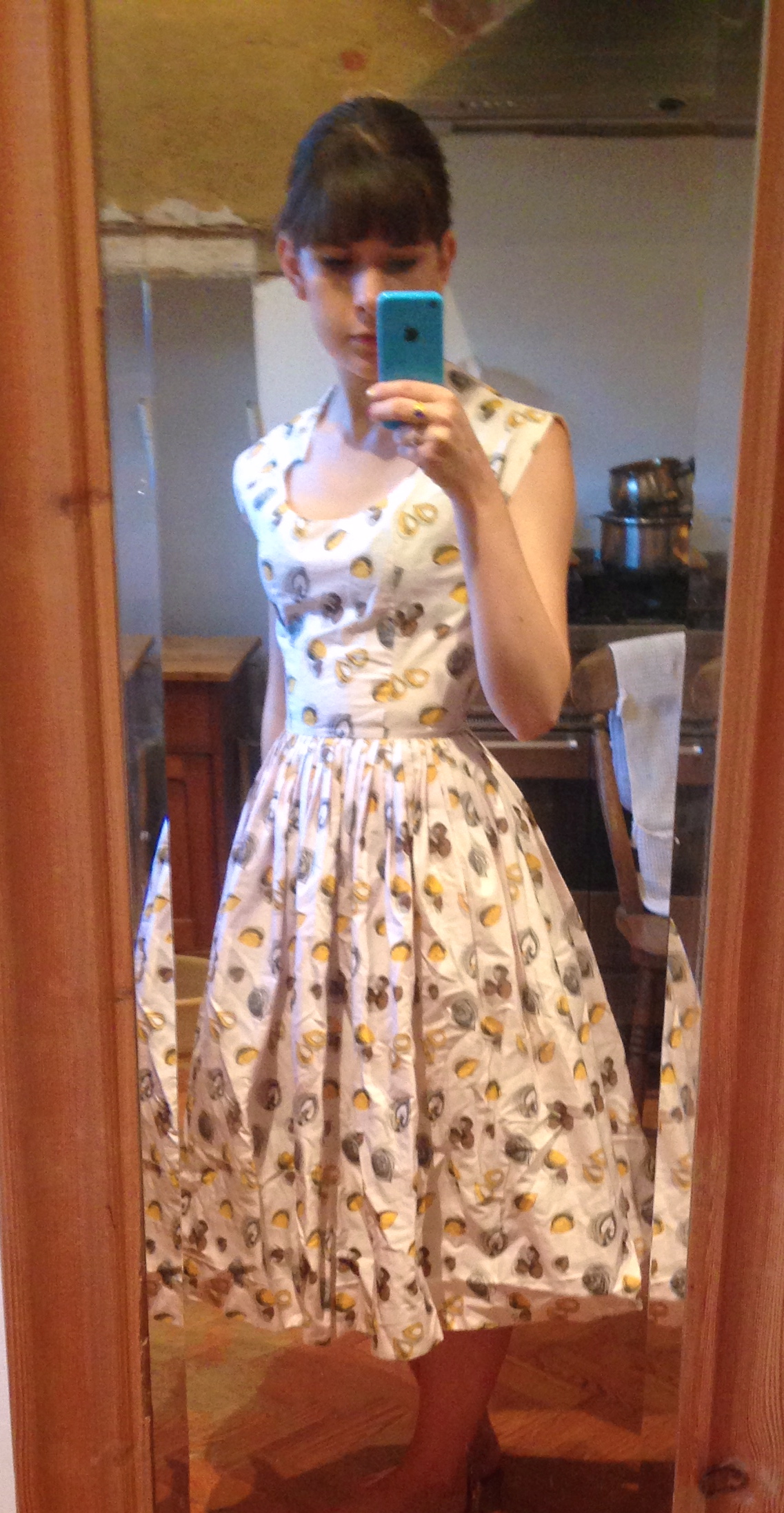
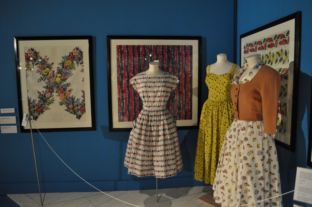
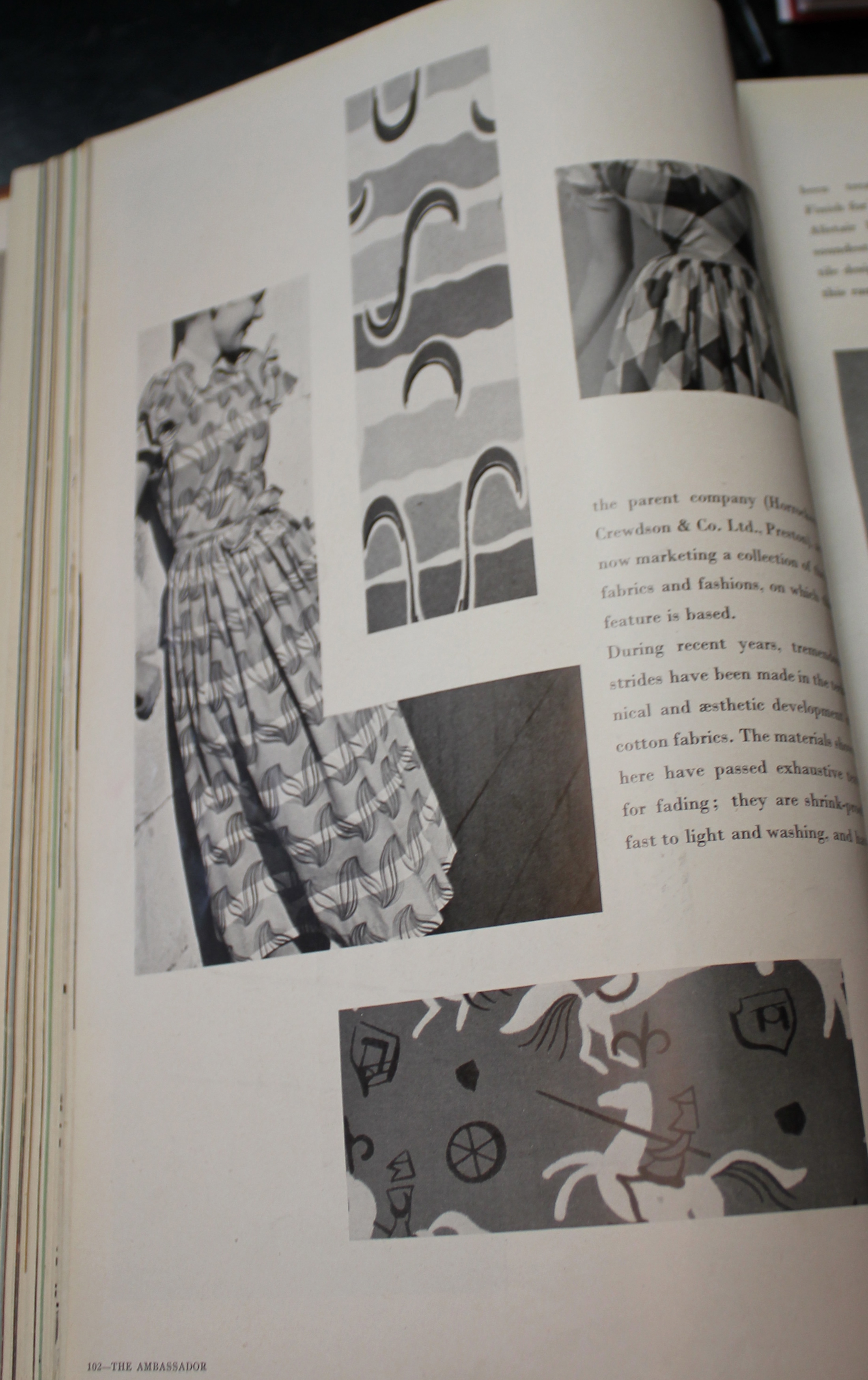
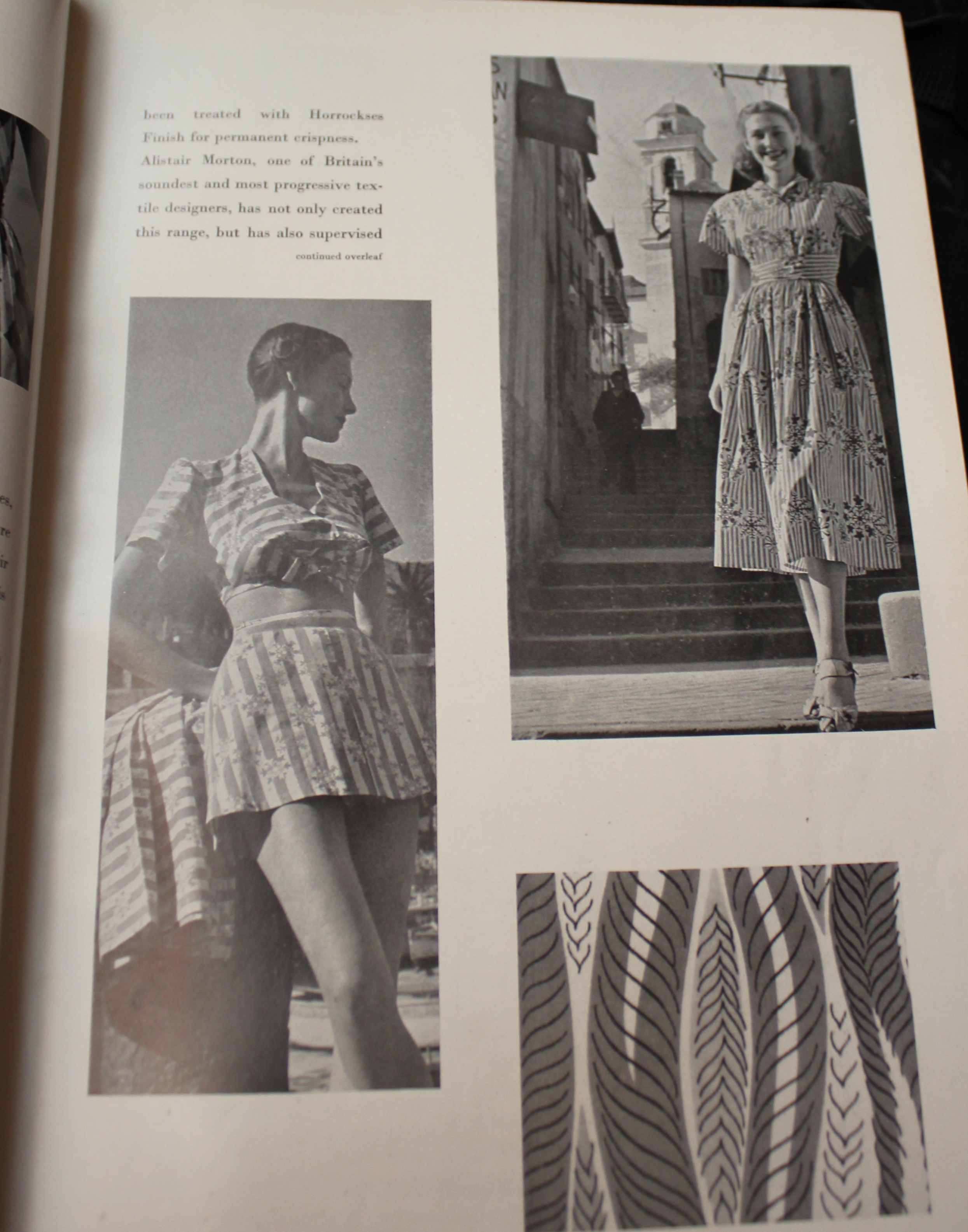
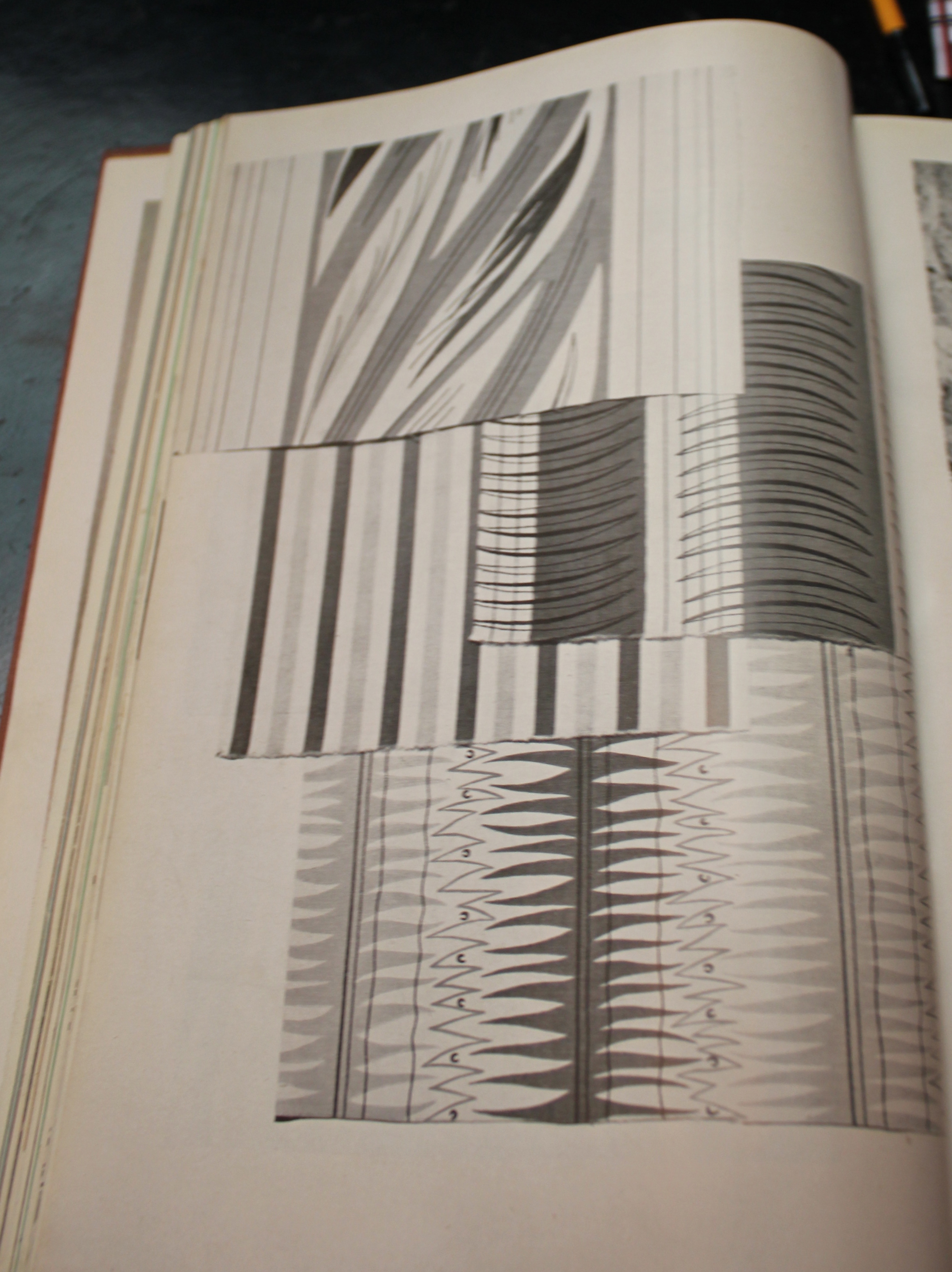
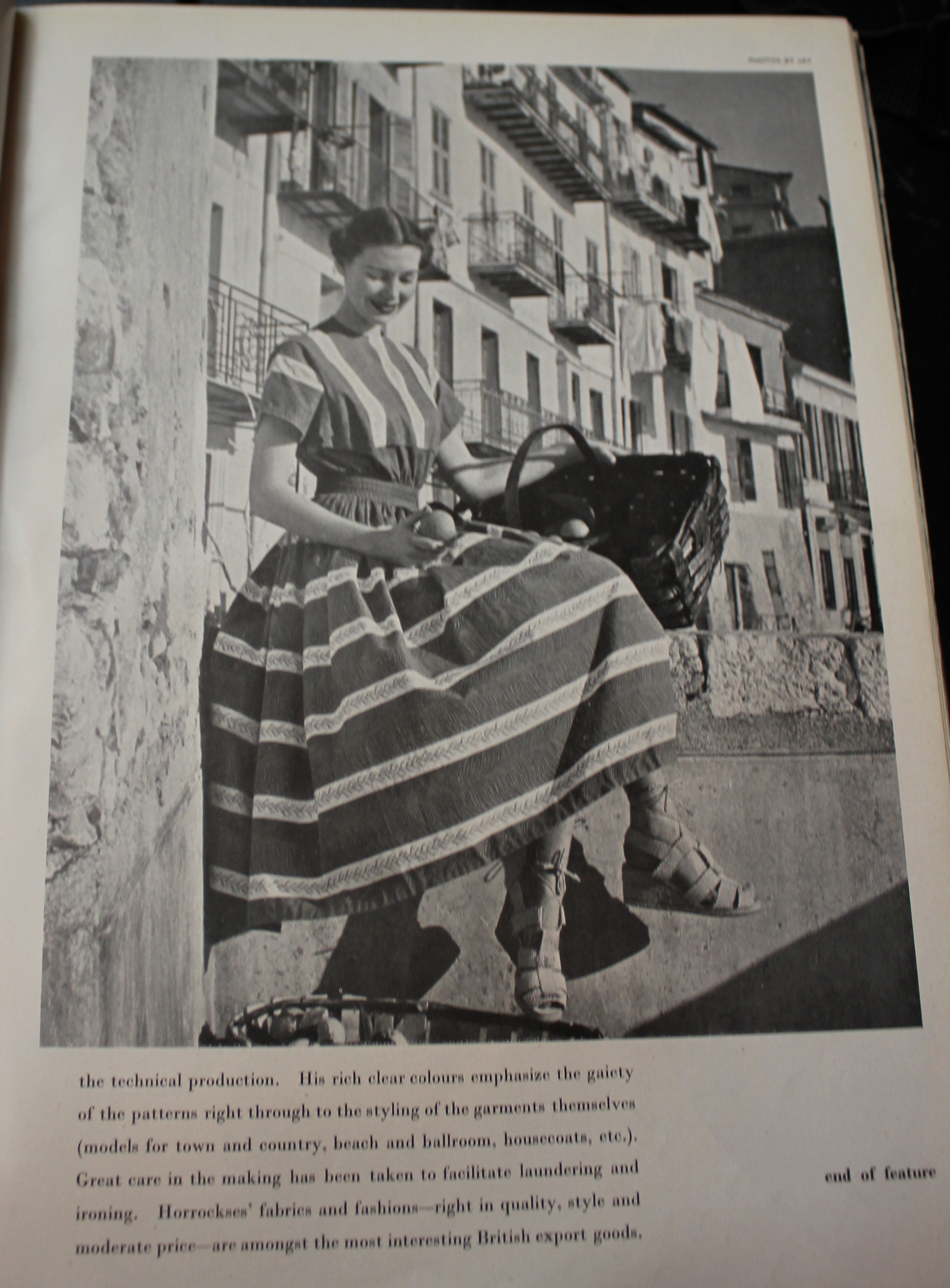
Therefore when going through a January 1950 copy of the Ambassador today I was pretty damned excited to turn up these four designs.

IMG_2309

IMG_2310

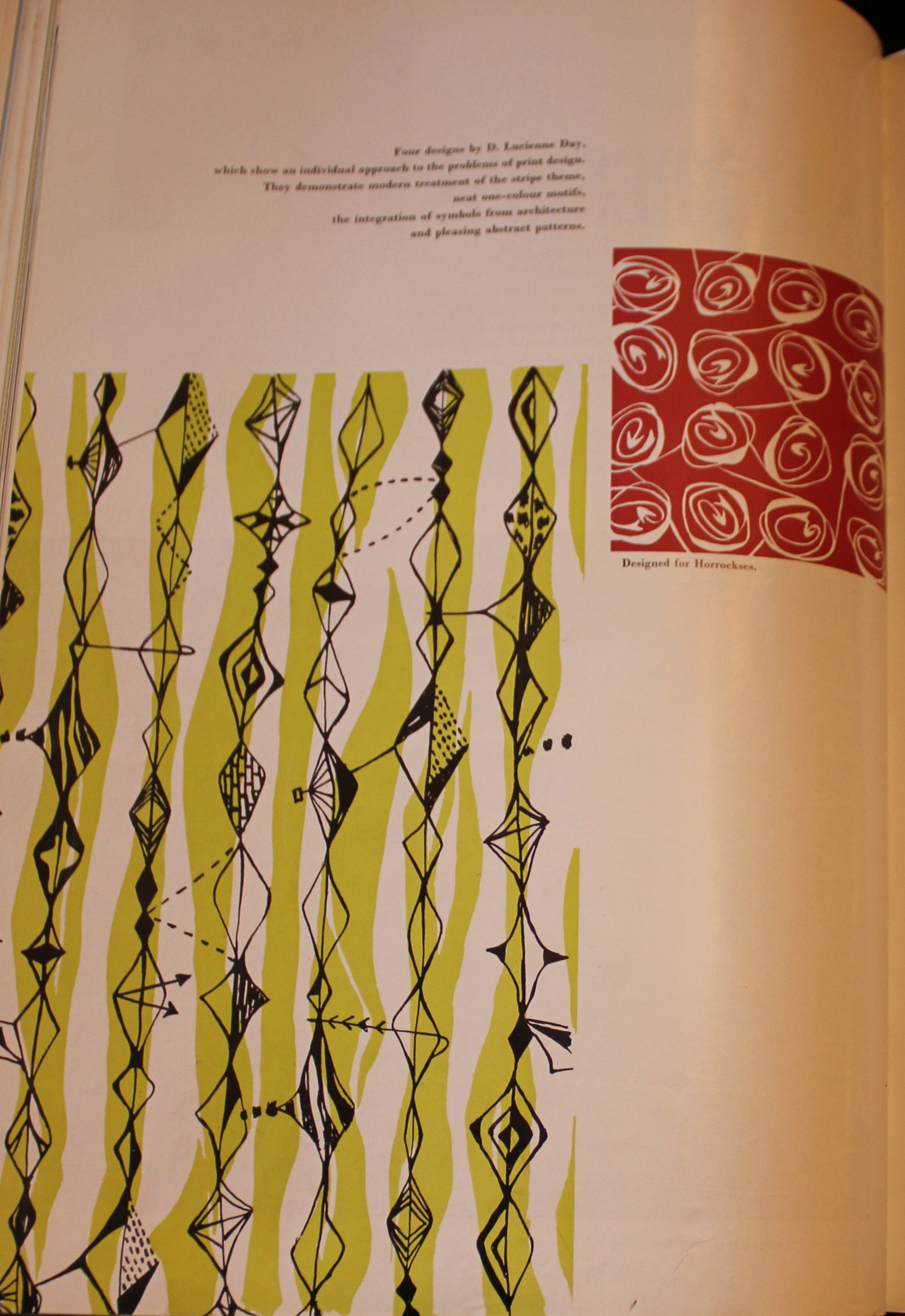
Designs by Lucienne Day for Horrockses

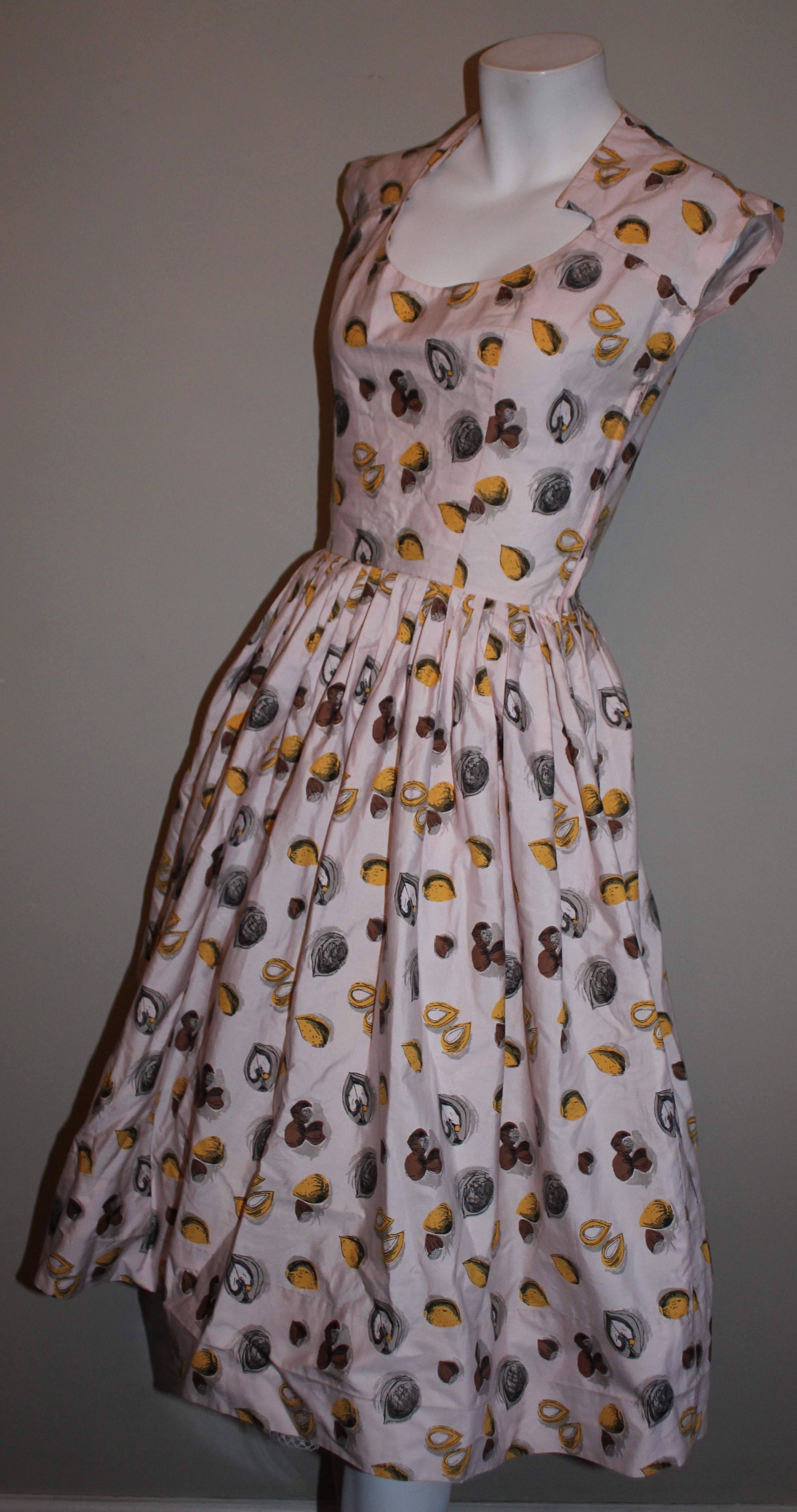
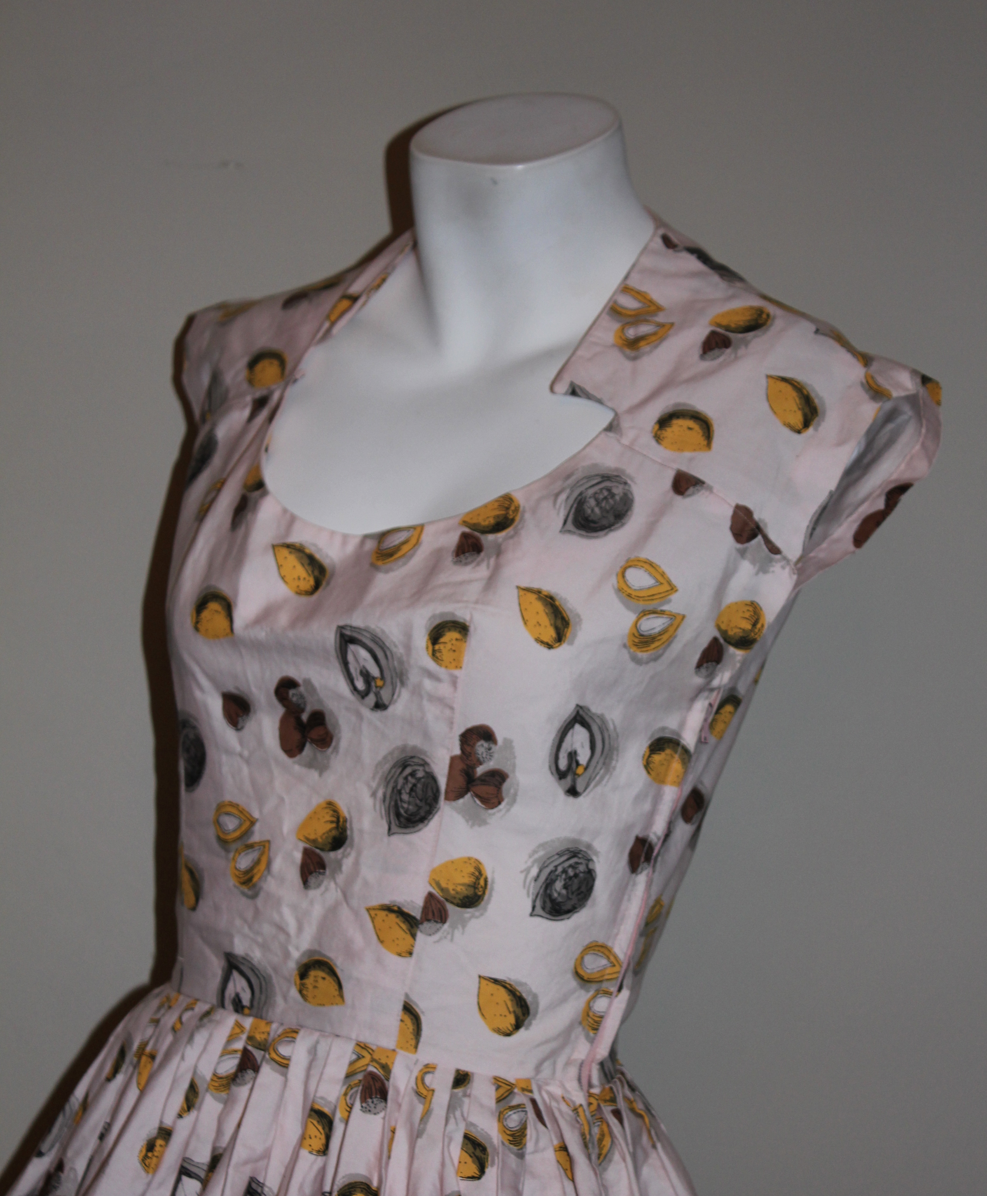
So keep your eyes peeled for these prints on Horrockses garments, because if you find them I think this would count for vintage gold. I think all four are Horrockses (other designs throughout the article only mention one manufacturer per page), although it *might* just be the red abstracted rose design.

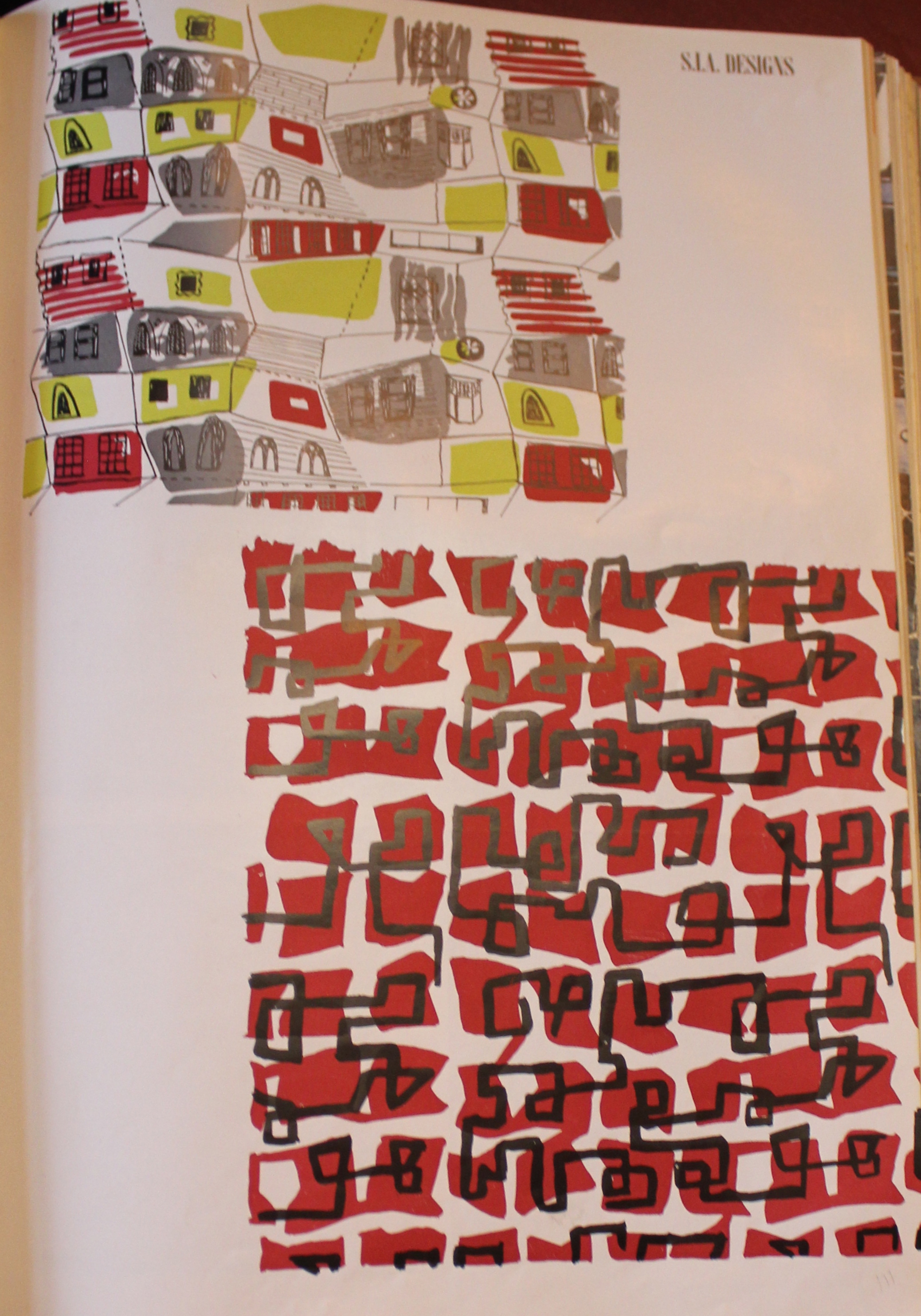
As an aside, these images come from an article on the “Society of Industrial Artists” for its Biennial review. I believe this was to promote the use of British artists by British fabric producers. I’m going to keep my eye out for more booklets/ articles relating to the Society of industrial Artists, the images found on these pages were certainly pretty inspirational.

The images too also interested me as they quote Day’s name as D. Lucienne Day. Her name was actually Desiree but she didn’t use this name. This is the only time I have ever seen her referenced as this! This is quite early on in Day’ fame as a designer. 1950 was the year that she designed her first textile for Heals, ” Fluellin” and gained widespread recognition.

For two further posts relating to Day and Horrockses take a look here and here 

Nutty for Novelty

When it comes to buying Horrockses i have some kind of weird radar. I can spot one straight off, I don’t have to touch it, it’s just a case of having bought over 90 (gulp. I feel a bit sick to say I have bought that many…although a few have been sold along the way!) I just know them instinctively. That radar was blinking at its best this week when I turned up this delight (It was so cheap I still can’t get over it).

IMG_2029

I snapped it on my manni for full effect. The matching bolero is quite cute and it also has pockets on the hips (I love a good pocket on the hips, perf. for making your waist look smaller)

IMG_2026

IMG_2030

I knew the print too, having remembered seeing it amongst John French photographs previously. This means the dress can be dated to 1956.

447936

I actually ended up wearing the dress out last night as my Mum was up from Hampshire for the weekend. I snapped a few quick pics on my pretty snaz new iphone (gahhh new technology!) before I went out. I actually shared the dress on my instagram last night too (come and follow me on instagram too, I am @liztregenza)

IMG_0969 IMG_1023

The graphic quality of the design means it is more difficult to ascertain the designer, but if I had to put money on it I would say it is a Joyce Badrocke design as it reminds me a little of a sketchy pink print I have seen by her.

I also recently acquired this Horrockses thanks to my friend Holly. We like to keep an eye out for each other when we are at fairs/ markets and the like so when she text me with this number the only answer was Yes please!

IMG_2031

IMG_2032

IMG_2035

The print explains the title of this post, oh my, I love a pun (sorry it really is terrible).

I took a few quick snaps of it on too (sorry about my face, i had just cycled home from work when I took the pictures- the dress is also incredibly creased because it has been in a suitcase for the past two weeks!)

IMG_1027

IMG_1028

The print is definitely a Pat Albeck, I suspect it originally had a little matching jacket like the one seen in the Horrockses exhibition. Although, perhaps not as mine is not the same cream shade, but is in fact a very subtle pink with a matching more “blush” pink sash. I’m not 100% on the date of this, but I would think ’55 ish.

What I quite like from the Horrockses exhibition is that behind this dress you have one of Albeck’s fruit designs. Similar to that in my Horrockses.

13-08-25

Hope you like my new finds : )

New (old) dress purchases

I honestly think I have a problem when it comes to buying dresses. I need to pay my masters fees, but instead I have purchased lots more dresses. It’s a real life problem.

Anyway, I thought i should share one of said dresses because a) it’s fabulous and b) it’s a Horrockses

IMG_0660

IMG_0661

This lovely Horrockses number (yes, another one!) came from a lovely lady I fleetingly saw at the Chap Ball last year. She was wearing  what can only be described as the most fabulous dress I have ever seen. Anyway, we became friends on facebook and she offered me this simply sensational Horrockses which i could not resist adding to my collection.

The dress is from 1948 and the print is by Alastair Morton, you can see the dress in a slightly different colourway in this advert. The dress cost £5.7. 8 a fair sum for a printed cotton frock in the period. The advert featured in Vogue in May 1948.

IMG_9055

It’s interesting to see that the price of this dress is also shown with relation to the amount of coupons it would have cost (10). This was because rationing was still in force in 1948 (read more about rationing here). I was also interested that the dress fastens down the back with buttons, whereas a zip fastening would have probably been better. Again, I think this is probably due to rationing. Although I do have a few earlier Horrockses with zips most do fasten with buttons.

This advert also suggest that the dress was an exclusive to Harvey Nichols. I wonder whether this was just the dress in this colourway, or whether the actual print was an exclusive. My dress only has the Horrockses label, so I can’t be sure.

I was then rather chuffed to find an article ( by absolute accident) in the April 1948 issue of Ambassador. Images from the article are below, and you can see a number of absolute classic Horrockses prints that I have seen time and time again featured in it. I have also transcribed the full article as owing to my terrible photography skills you can’t really read it!

IMG_1280 IMG_1281 IMG_1282 IMG_1283 IMG_1284

Horrockses style new fabrics and fashions

For many generations the name Horrockses has been a household name  synonymous with quality cotton goods. Horrockses fashions ltd. Makers-up of cotton fabrics produced exclusively for them by the parent company (Horrockses crewdon and Co. ltd. Preston) are now marketing a collection of fine fabrics and fashions on which this feature is based.


During recent years tremendous strides have been made in the technical and aesthetic development of  cotton fabrics. The materials shown here have passed exhaustive tests for fading; they are shrink-proof, fast to light and washing, and have been treated with Horrockses Finish for permanent crispness.


Alistair (sic) Morton, one of Britain’s soundest and most progressive textile designers, has not only created this range, but  has also supervised the technical production. His rich clear colours emphasise the gaiety of the patterns right through to the styling of the garments themselves (models for town and country, beach and ballroom, housecoats, etc.). Great care in the making has been taken to facilitate laundering and ironing. Horrockses’ fabrics and fashions- right in quality, style and moderate price- are amongst the most interesting British export goods.  

In a moment of intense geekery I was particularly interested to note the mention of Alastair Morton here, as Horrockses were keen to portray a total image for the brand rather than convey the individual designer. Here, and also in a later 1948 issue of Ambassador (an altogether similar feature) Morton’s name was prominently featured. Perhaps early on in their marketing strategy this was a technique they chose to follow, before later ( i reckon after Cleveland Belle became director) abandoned. My other thought on this is whether this was actually an extended advert that Horrockses paid for, or whether this feature was of the Ambassador magazine’s choosing…If this was not a promotional feature it was certainly unusual for a single company to take up a whole article in this manner for Ambassador and again suggests the importance of the brand in the late 1940s.

On a slightly related note, if you want to help me out, so I have the money to pay my masters fees ( I promise I won’t spend it on more dresses) I have lots of fabulous pieces in my etsy shop right now, and on my ebay too.