Horrockses and Margaret Meades

A few weeks ago I received a rather exciting email regarding Horrockses, and I suppose this blog posts as both a plea for anyone who owns/ has owned certain dresses and also providing some more information on the brand.

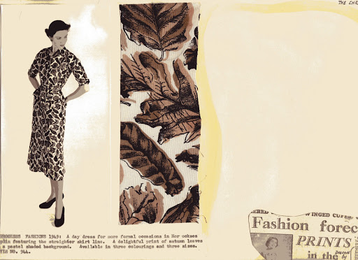
Horrockses during the 40s and 50s employed a large number of different designers to create their printed textiles, some such as Eduardo Paolozzi created only a few desings, whilst others, such as Pat Albeck and Graham Sutherland created huge numbers of designs for the company. Some designers, Albeck is a great example, have a very distinctive illustrative style which can be quickly recognised. Although others output and style was more varied. I know that some of the print designers worked on commissions for the fashion designers at the company (a lobster print created for John Tullis by Pat Albeck is a particular favourite of mine).

A typically Albeck design.

Although I have come across a large number of print designers for Horrockses  a chance search on twitter a few weeks ago turned up researchers gold.

One of the most special Horrockses I have is one printed with “Elizabeth Regina 1953”. Tht tweet related to this very print. The print was designed by Margaret Meades who worked freelance for Horrockses. Her designs weere mostly used in the early years of Horrockses fashions (late forties early fifties). 

Margaret trained at  Manchester College of Art where on graduating she continued to lecture for many years. Margaret was also a member of the Society of Industrial Artists.


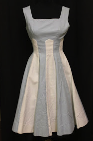
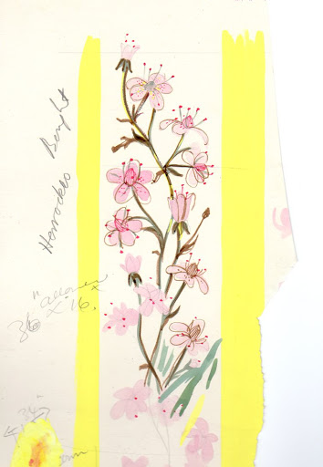
Here are a few more of Margaret’s designs which were kindly sent to me by her daughter. It would be great if anyone has the original dresses, so that they can be compared to her designs.

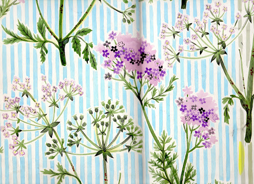
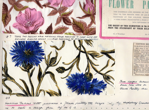
The print above has to be my favourite by Meades, and is also very familiar, I feel sure I have seen this one before!


If you would like to find out more about Margaret Meades do visit the website

http://highlandpaintingandprints.co.uk/index.html

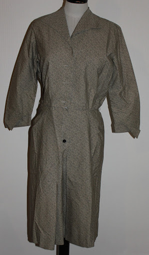
Also! If you have orignal dresses that feature any of the prints i have shown please do send me pics.

liztregenza@hotmail.com

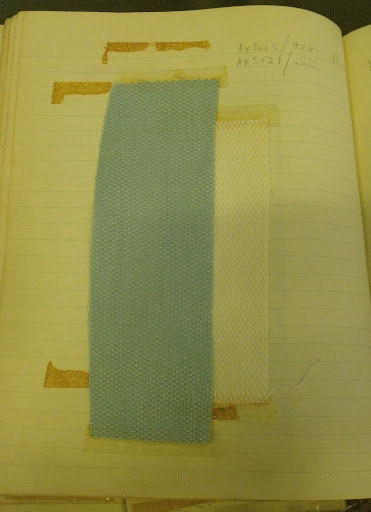
A quick note: All of these designs were sold to Horrockses, but they were not necessarily produced. As I explained in my post for Unmaking things Horrockses always overpurchased on textile designs to retain their design prestige.

You can read my post on Horrockses and marketing here

An interesting Horrockses dress: round 2

It’s incredibly rare that I ever admit I am wrong, but today I concede to the fact I am.
As any regular readers of my blog will know I am pretty obsessed with the brand Horrockses. In 2011 I did some pretty in-depth research into the delightful dress below which had once been owned by Lucienne Day. I had always suspected with its complicated construction that this dress had been designed by John Tullis. On Wednesday I found concrete proof that I had infact got the designer of the dress incorrect : o!!!
 
Hampshire museums service
Dress accession no: C1999.146.2
Photo © Liz Tregenza
If you are interested in the full story behind the dress (ignoring the part about John Tullis!) youcan read it here.
So how did I find out I was wrong? I was visiting the AAD at Blythe House, and decided to have a look through some of the sketchbooks that had belonged to Betty Newmarch who was one of Horrockses fashion designers (along with Marta Pirn anD John Tullis). These three sketchbooks were filled with a veritable wealth of information and have allowed me to date a number of dresses I own more accurately. In the book dated Summer 1956-57 I came across this sketch.
     
IT’S THE ORIGINAL SKETCH AND FABRIC SAMPLE FOR THE DRESS!!!!
As an interesting aside the sketches were not actually drawn by Betty Newmarch, but by her sketch artist Patricia Hunter. Sadly, as of yet I have not found any information about Hunter, but it would appear most of the distinctive sketches associated with Horrockses were infact drawn by her. I suppose I had always assumed that the fashion designer would complete the sketches themselves in this period, but it would appear not!
So back to the dress, what I also found interesting was that there were quite a number of these extravagant pique cotton dresses scattered through this sketch book, and it appears that when dresses were left plain this was a “go to” fabric for Horrockses.
                      
                              
This is another example of a similarly delightful sundress and bolero using white and yellow pique cotton. A housecoat later on in the sketchbook (also made from this pique) is illustrated as being “made exclusively for Simpson’s Picadilly”. It is interesting to note that a number of dresses had certain shop names written above them, suggesting that they were produced exclusively for a particular shop.
So what has this taught me? The value of research, for sure and also that your instincts (however strong) aren’t necessarily right.
Sketchbook accession number: AAD/1995/16/5/1

Valentino: Master of Couture at Somerset house

Last week I ventured to Somerset House to see the Valentino exhibition. I’m not the biggest fan of Valentino- I’m not sure why, but his designs simply have never really done it for me, too ostentatious and too Italian I suppose : /. Anyway, after hearing great things about the exhibition (in particular about its layout) I decided to take a visit.
I have to say it was an hour well spent. The layout of the exhibition was superb, as I expected. The long tunnel in Somerset house helps to give the exhibition a very intimate feel, and the mannequin layout meant you were able to get relatively close to the dresses, and see all the details.
The mannequins too are fantastic, and very lifelike. It is great having the variety of seated and stood mannequins which gives a good understanding of the way the garments move with the body.
I particularly liked the Valentino garments from the 50s and 90s. I realised that much of my dislike for Valentino applied to his early 00s garments, although overall the embellishment and detail within each piece was jaw-dropping. You could really see the process of designer revisiting and re-inventing designs from his archive.
 The textile techniques downstairs at the exhibition really gave a clear view of how different details on the garments were made, and due to my own background in fashion design I couldn’t quite get over the sheer volume of work that must have gone into some of the dresses.
The wedding dress downstairs too, is just beautiful, so romantic, timeless and “intimate” (I know that’s a weird word to describe a dress…but that just conveys what I felt about it). I think this has to be the highlight of the exhibition, especially the way you walk up to it, almost as if you  are the groom, seeing the bride.
Complaints? For me, the details about the dresses were pretty scant, but  then again I like to leave an exhibition feeling like I’ve been educated. After leaving Valentino I felt like my eyes had been treated to beautiful things, but I didn’t really have a lot to say.
For example I was absolutely fascinated by the series of garments from 1990 which were originally designed in the 50s. I was desperate to know how, and why this came about… I think I’ll have to take a look at some of the Valentino books on offer for some more info.
I feel like this is a fashionistas exhibition rather than a fashion historians, but deeply enjoyable nonetheless.
Valentino: Master of couture is on at Somerset house until 3rd March.
Images all from the Somerset House facebook page.