Pat Albeck: Legendary textiles designer

Anyone who reads my blog knows that I have a worrying obsession with the fashion brand Horrockses. Last Friday I had the opportunity to go and see the Horrockses exhibition again, this time at its new location Basildon Park near Reading. Connected with exhibition there was a special talk by Horrockses print designer Pat Albeck. Not only was Pat lovely, she was completely inspiring and despite not really being a print designer it gave me a desperate desire to get designing!

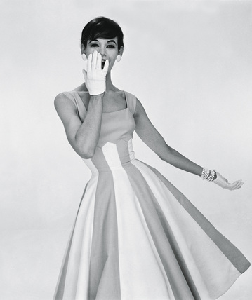
As soon as I entered the room Pat spotted me, coming up to me and saying “That’s one of my designs!”. I was wearing one of my many Horrockses dresses, although I have to say the one I chose is one of my favourites. She asked me if she could touch it and said about how lovely the dress still felt after all this time, asking me to come up and do a twirl for the audience! I had a feeling that the dress I had chosen to wear *might* be one of her designs but I was very glad that my suspicions were correct!

Pat began her career with Horrockses whilst she was still a student at the Royal College of Art. James Cleveland-Belle the then Director of Horrockses was keen to use the design skills of some of the students from the college and spotted Pat’s work. Cleveland-Belle went on to become a great friend and also one of Pats inspirations. She says she remembers the magical feeling when Cleveland-Belle signed off one of the sketches JCB meaning it would go into production.

The first design which Horrockses bought from Pat was this iconic pattern which has been used again recently by the V and A for a new range of Horrockses based textiles. Whilst at the Royal college Pat had two of her designs commercially produced by Horrockses. The Royal college of Art felt it was important for their students to work within industry encouraging Pat to spend one month at college and one month working for Horrockses.

Pat also remembered a dress which she owned before working at Horrockses ( a member of the audience piped up that she remembered Pat wearing it and looking beautiful in it!). The dress was lemon yellow with stripes and little egg shapes with flowers inside.

During the five years Pat worked for Horrockses she designed a wide variety of different prints drawing inspiration from all sorts of things around her. Employees at Horrockses were encouraged to used their holidays to inspire there work and Pat remembers a holiday in Venice which particularly inspired her work. Pat found that she drew anything that grabbed her, buildings, kitchens, gardens, flora and fauna.

Pat felt that the luckiest thing was that she was designing fabric for actual dresses which she would see made up. Her designs were not to be sold as fabric to be made up by the general public. She liked to have a specific dress design which she knew the design would be used for and the knowing precisely what her fabrics would be used for. One of her oddest requests for a print design came from John Tullis (who designed most of the “specials” and evening dresses). The design had to incorporate a lobster. I have to say this is probably one of my all-time favourite Horrockses prints, and I love the way the lobster is softened by its combination with the butterflies and flowers.

Pat also said about the amazing reputation Horrockses had in the 50’s it was THE big company in the U.K. and was widely copied. Horrockses dresses (back then as they are now) were highly sought after and she says that the dresses did wear out because people wore them so much (this makes me feel a little big smug about my ever growing collection!)

After 5 years with the company Pat left in 1958 with Cleveland-Belle gone Pat felt it was time for her to move on too.

I will write further about Pat’s later career in my next blog post.

http://printpattern.blogspot.com/2011/01/v-shop-textile-design-gifts.html

A vintage adventure: Horrockses and Lucienne Day

For around the past four years I have been madly obsessed with the fashion label “Horrockses fashions” The company began in 1946 and was hugely popular throughout the 1950s being the big name in cotton fashion and promoting the luxury and glamour of cotton. Almost as soon as I started at the museum service I hunted for any Horrockses in the collection to add to my database of prints and styles. There was one dress at the time that particularly stood out to me, a simple blue and white cotton poplin day dress, it interested me because it contained not only a Horrockses label, but also a Harvey Nichols cotton shop label. This was obviously an expensive piece when new.


Dress accession no: C1999.146.2
Contrary to popular belief Horrockses did not produce all of their fabrics themselves (this was especially the case with dresses made in jersey, silks or satins). Most of the cottons were produced by the Horrockses parent company, but some types of cotton still were produced elsewhere. One such example was cotton poplins. Cotton poplins were used for more expensive garments, particularly evening wear. Poplins tended to be bought in from Ashton’s or from Holden’s.

I then forgot about this dress for a good few months. I t wasn’t until march when I went to the designing the decades: 50s talk at the Victoria and Albert museum that the dress came to the forefront of my mind again. At the talk the textile designs of Lucienne Day were discussed. I had always liked the abstracted prints of Day, but the talk gave me a whole new appreciation of her work. When I returned to the museums service the next week I mentioned to my boss about how much I had enjoyed the talk, and she told me that there were two dresses originally owned By Day in the Hampshire Museum Service collection. I search on the Modes record and couldn’t quite believe it when one turned out to be the Horrockses dress which I had been so interested by previously! It was amazing to find out that such an iconic dress had been owned by such an iconic lady.

I continued to research a little further and turned up trumps by finding a John French fashion photograph of the dress via flickr, which was attributed to the V and A. This really allowed me to see how the dress would have looked on and appreciated how the relatively stiff cotton pique would have created a very distinctive silhouette.

John French regularly photographed Horrockses fashions. He has quite a distinctive style where the dress is allowed to do the talking which perfectly suited the style of Horrockses dresses. Horrockses often advertised in Vogue, and their advertisements (which often used French’s photos) tended to be very simple featuring just the dress and Horrockses in Serified font. This was meant to draw associations to luxury labels such as Dior etc which often advertised in a similarly simple way.

Then a few weeks ago my research came to a somewhat surprising and pleasant end. I decided to re read my Horrockses book by Christine Boydell, and lo and behold again there was the John French photograph in front of me, with more details about the styling of this dress and French’s photographs.

After re reading the book I have come to the conclusion that this is probably a design by John Tullis due to the relatively complex construction of the dress. Tullis was renowned for the complex cut of his dresses, which many of the seamstresses complained were a nightmare to stitch! Tullis got his training at Molyneux the couturier in Paris. This couture training could be one of the main reasons for the complicated cut of many of his garments. If you spot a Horrockses with a particularly complicated bodice, or details like pockets on the outside of a dress, then it will be probably be a Tullis design! The fabric suggests that this may have been one of their “specials” dresses. This is further suggested by the fact that Harvey Nichols was one of Horrockses biggest customers, and one of the main suppliers of Horrockses garments in London. There was a special relationship between Horrockses and Harvey Nichols. It is known that Horrockses produced special dresses which were exclusive to the store or used particular fabric designs fro them.

If you look at the pictures you can see the interior construction of the dress. I assume that the dress has been altered at some point. Day was quite petite so it was likely the dress was taken up to suit her frame (this has bee hand done, most other cotton pique Horrockses dresses I have come across are machine finished)

So there you go, not only is this dress a beautiful piece which is totally evokes the mid 50s but it is a piece with an interesting and varied history which links a number of different areas of design history together.


http://www.vandaprints.com/image/447900/a-horrockses-cotton-poplin-dress-photo-john-french
http://www.sneakymagpie.com/furniture/design-heroes-robin-lucienne-day/

A complete blog overhaul


As much as my blog title “High-waisted,? Corseted? Floral?” Is still very much me I feel its time for a change. Nothing major, just a little bit of an update now I am trying to get all technical and add things like twitter to my blog : /

I could realistically just call my blog obsessed with Horrockses, considering how much I write about the brand, and the simple fact that I rarely go a day without thinking about Horrockses dresses in some respect (it really is rather worrying. I have to say).

But no, something a little more different. The first thought that popped into my mind was The vintage Vanguardista ( Spanish meaning cutting-edge or avant guard) but I came to realise that actually when you translate it doesn’t really make that much sense I just liked the sound of it.

Then, after slipping into thoughts of summer time and watching the tennis it came to me Advantage in Vintage. I could play around with this idea all day long. The vintage advantage (go on try and say it, it’s a tongue twister if there ever was one!), Advintage or even just advantage vintage. So yes, a blog overhaul and a new name. Lovely.
The picture is of me wearing one of my beloved Horrockses dresses